The Order List is a repeater-based element that displays orders from your store in a list layout. It automatically generates a tile for each order based on the connected data source and any filters you apply. Each tile is a Div Container, which you can fully customize with elements like images and text. Any dynamic data added to these tiles will automatically reference one of the many orders in the list.
Order list allows you to create separate tile designs for completed and refunded orders. To do this, locate Statuses nested inside the Order List in the right-hand sidebar under the Structures tab. Use the dropdown to switch the editable tile between completed and refunded, then design each version separately. Builder will apply your design to all orders of that type.
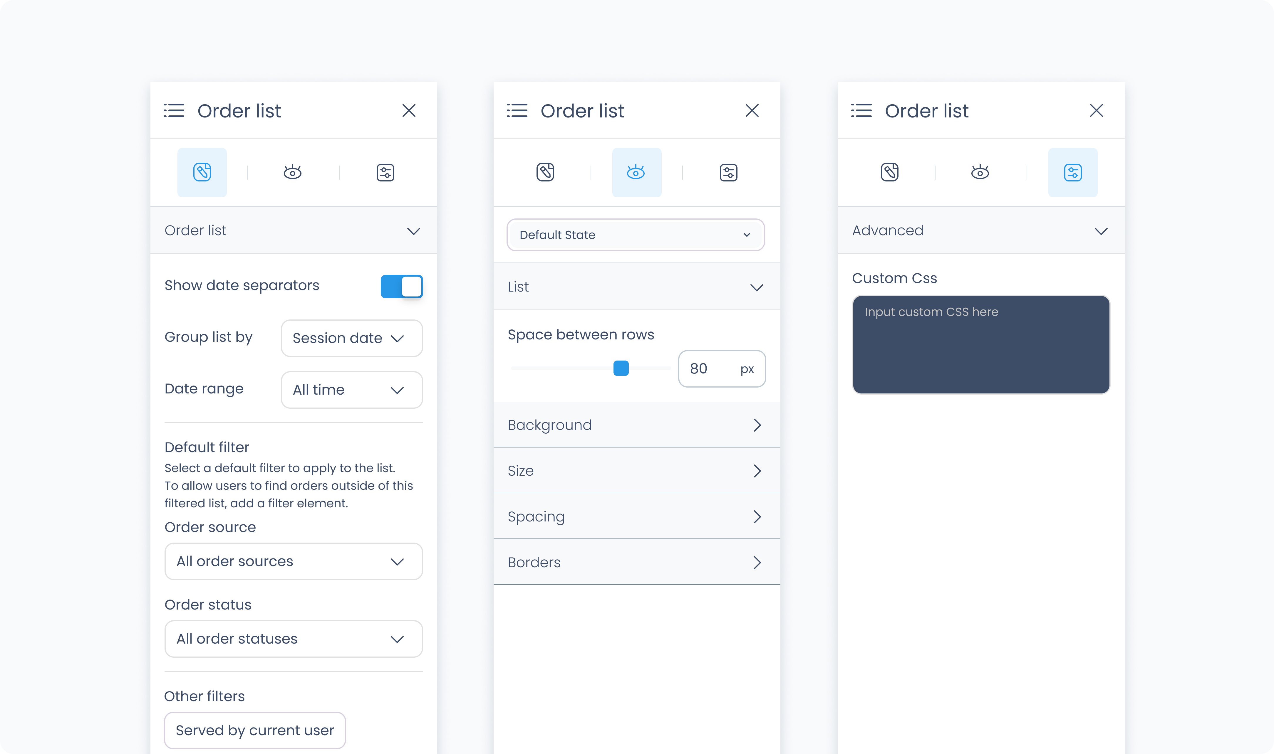
The Editor tab controls which orders are shown in the list and how they’re grouped or filtered.
Show date separators – Toggles visual separators between orders from different dates.
Group by – Choose how orders are grouped (e.g., by Order Date, Updated at).
These settings define the initial filters applied to the Order List when the flow loads. You can add a Filter Tab element to let users change filters at runtime. Make sure to set its Target to the Order List element.
Date range – Filter orders by time period (e.g., Today, Last 7 Days, All Time).
Order source – Show orders from specific sources like POS orders or 3rd party channels.
Order status – Display orders based on status (e.g., Completed, Refunded, Partially refunded, etc.).
Other filters – Further narrow results based on context:
All – Show all orders.
Active customer in cart – Only orders linked to the current cart’s customer.
Selected customer in list – Filter by selected customer in a customer list.
Current Outlet / Station – Limit to orders placed at the current outlet or station.
Served by current user – Only show orders handled by the logged-in user.
The Styler tab controls the visual layout and styling of the Order List element. You can configure spacing, borders, shadows, size, and background color. This affects how the entire list appears in your flow.
Aside from styling the list itself, each tile inside the list can be styled independently, just like a normal Div Container.
At the top of the Styler tab, you can define how the list appears in different states:
Default – Normal appearance
Hover – When hovered over
Active – When tapped or clicked
Disabled – When the list is inactive
Each state can have its own styling applied.
Space between rows – Defines vertical spacing between order rows in the list. You can use px or % units.
Background Color – Apply a solid background color to the list. Supports static, global, and dynamic values.
Height and Width – Controls how the list fills space in its parent:
Fill – Expands to fill the parent container
Fit – Shrinks to match the content
Scroll – Enables scrollbars if content exceeds size
Custom – Set a fixed pixel or percentage value
Spacing controls the outer and inner space of the element:
Padding – Adds space inside the element (between the content and border).
Margin – Adds space outside the element (between this and surrounding elements).
You can apply padding and margin:
Per side (top, right, bottom, left)
Or use Apply All to apply the same value everywhere
Radius – Rounds the corners of the grid. Set each corner or use Apply all for uniform rounding.
Styling – Choose which borders to show (all, none, specific sides).
Border width – Set thickness in pixels.
Border color – Supports static, global, or dynamic values.
Border style – Select from solid, dashed, or dotted borders.
Shadows – Adds depth to the grid using drop shadows. You can:
Adjust X and Y offset
Set blur and spread
Choose a shadow color
Use Clear all shadows to remove them
Controls how date dividers in the list (such as “July 23, 2025”) are styled.
Color – Choose a static, global, or dynamic text color.
Alignment – Align the divider text to the left, center, or right.
Font Size – Use the slider or type in a pixel value for the font size.
Text Font – Choose from available fonts such as Poppins.
Font Weight – Set how bold or light the font appears.
Adjusts how much space surrounds each divider line and text.
Padding – Controls space inside the divider container (around the text and line).
Margin – Controls space outside the divider container (between other elements or rows).
You can set spacing individually or apply values to all sides at once using Apply all.
Controls the style of the line shown beneath each date divider.
Radius – Round the corners of the line.
Styling – Choose which borders are applied (top only, bottom only, all sides, etc.).
Border Width – Set the thickness of the divider line.
Border Color – Pick the line color using static, global, or dynamic values.
Border Style – Choose between solid, dashed, or dotted.
Apply drop shadows behind the divider line for extra depth or contrast. Adjust shadow direction, blur, spread, and color. Use Clear all shadows to remove them completely.
The Advanced tab provides options for adding custom styles to the order list.
Use this field to apply custom CSS rules to the entire order list. These styles override any settings configured in the Styler tab. This affects the list as a whole and not individual tiles within it.
