The Div container is a flexible layout element used to group other elements together. It doesn’t have any visual appearance on its own, but it gives you control over how content is arranged and spaced. You can use a Div container to stack elements vertically or align them in a row, apply background styling, add internal padding, or control conditional visibility for a group of elements.
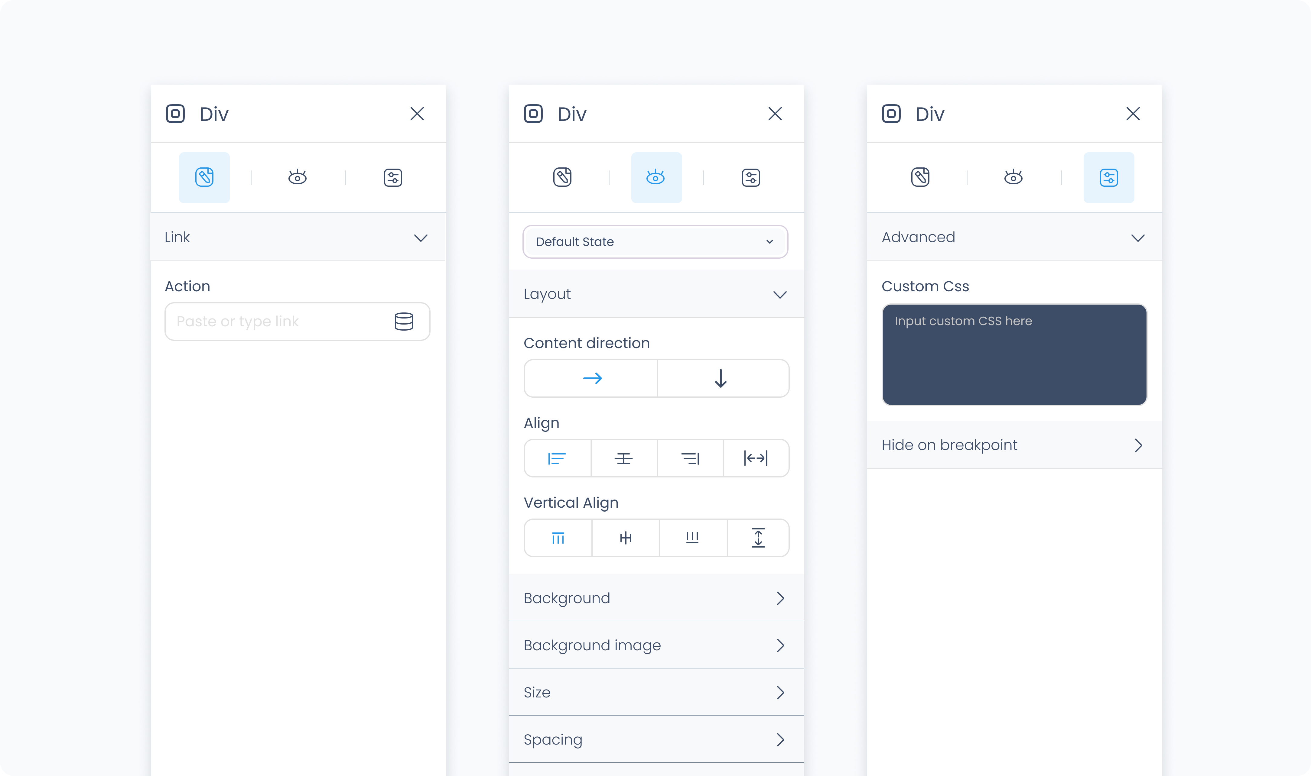
The Editor tab lets you assign an action to the container.
Use the Action section (lightning icon) to link an existing action or create a new one. This allows the container to trigger behaviors like navigating to another page, opening a popup, or triggering a dialog box when tapped or clicked.
The Styler tab controls how the container looks and behaves in your layout. You can adjust layout direction, spacing, backgrounds, borders, and more.
At the top of the Styler tab, you can define how the container appears in different states:
Default – Normal appearance
Hover – When hovered over
Active – When tapped or clicked
Disabled – When the container is inactive
Each state can have its own set of styles.
Content direction – Arrange child elements horizontally (left to right) or vertically (top to bottom).
Align – Controls how child elements align along the main axis (start, center, end, or space between).
Vertical align – Controls alignment along the cross axis (top, middle, bottom, or stretch to fill container height).
Gap – Sets space between child elements. Accepts values in pixels (px) or percentages (%). For example, 10px adds fixed spacing, while 5% adjusts based on the container’s width or height.
Background color – Apply a solid background color to the container. Supports static, global, and dynamic colors.
Background image – Upload an image or bind one dynamically to display as a background. This will fill the entire container unless otherwise styled.
Height and Width – Controls how the container fills space in its parent:
Fill – Expands to fill the parent container.
Fit – Shrinks to match the content’s dimensions.
Scroll – Adds scrollbars when content overflows.
Custom – Set specific pixel or percentage values.
Spacing controls how the container is positioned relative to other elements, and how its content is spaced inside it.
Padding – Adds internal spacing between the container’s edge and its content. Useful for creating breathing room around child elements.
Margin – Adds external spacing between the container and other elements. Use this to position the container within the layout.
You can apply padding and margin:
Individually per side (top, right, bottom, left)
Or to all sides at once using Apply all
Radius – Rounds the corners of the container. Set each corner independently or use Apply all for uniform rounding.
Styling – Choose which sides have visible borders (all, none, top only, etc.).
Border width – Sets the thickness of the border in pixels.
Border color – Pick a static color, or use a global or dynamic value.
Border style – Choose from solid, dashed, or dotted borders.
Shadows – Adds visual depth behind the container. Use the shadow controls to:
Set X and Y offset values to move the shadow horizontally or vertically
Adjust Blur to soften or sharpen the shadow edges
Set Spread to control how far the shadow extends outward
Change the shadow color
Use Clear all shadows to remove them
The Advanced Settings tab provides tools for more complex use cases, such as dynamic behavior or developer-level styling.
You can define custom CSS rules to override or extend the container’s styling. This is useful when you need fine control beyond what the Styler panel offers.
Conditional visibility lets you control when the container appears or disappears based on logic (e.g., only show if the role is admin).
To use:
Toggle Turn on conditions
Define your rule and set what happens (e.g., show, hide, or disable)
