The Tab Filters element displays a row of clickable filter buttons, each representing a value from a single data field. It's most commonly used with Product Grids or Order Lists to let users filter content by category, status, or type.
Unlike the Dropdown Field, Tab Filters are designed for fast, one-click filtering with clear visual feedback. They behave like radio buttons and only allow one filter to be active at a time.
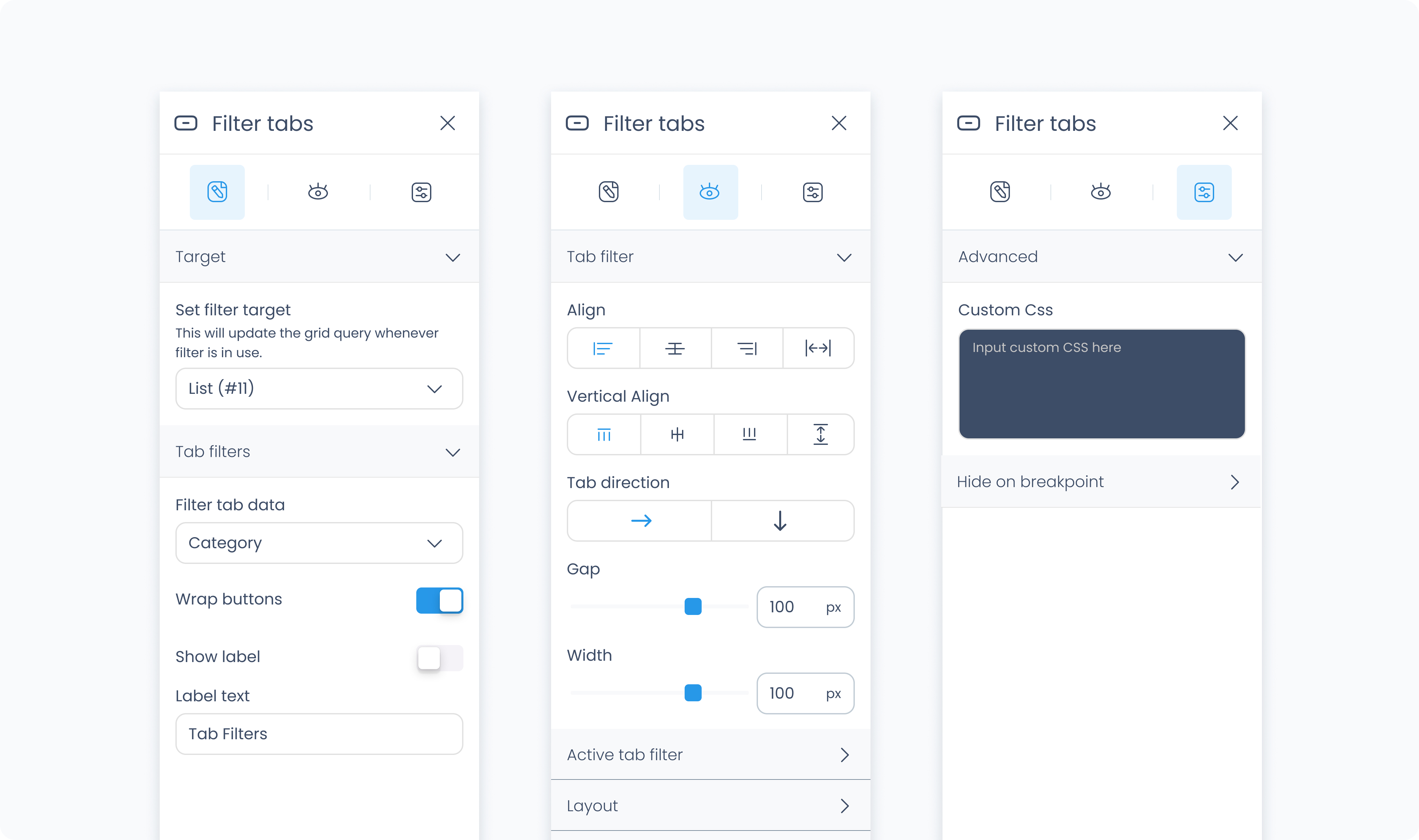
The Editor tab lets you configure what data the tabs filter, how the options appear, and whether the label is shown.
Set filter target – Choose which list or grid will respond to the selected filter value (e.g., Product Grid #1).
Radio data – Select the dynamic field that powers the filter tabs (e.g., Categories, Order Status).
Show label? – Toggle to show or hide the label above the row of buttons.
Label – Enter the text to display as the label (e.g., "Categories").
Wrap buttons – If off, tabs will scroll horizontally on overflow. If on, they’ll wrap to the next line.
The Styler tab allows you to customize the layout, spacing, colors, typography, and borders of both the tab group and the individual radio buttons.
At the top of the Styler tab, you can define how the Tab Filters appear in different interaction states. Each state applies to the individual buttons (tabs) within the group:
Default – The base style when no interaction is occurring.
Hover – When a pointer is moved over a tab.
Active – A brief state shown when a user clicks or taps a tab.
Selected – The appearance of the currently selected (active) tab.
Disabled – The style when the tab is unavailable for selection.
Content direction – Set tabs to stack horizontally (→) or vertically (↓).
Align – Align the overall tab group to the left, center, or right within its container.
Vertical align – Align the group vertically inside its parent (top, center, bottom, or stretch).
Gap – Adds horizontal or vertical space between tabs, depending on direction.
Height / Width – Choose between Fit, Fill, Scroll, or Custom. These settings apply to the overall tab container.
Padding – Adds internal space between the container's edge and the content inside. Set each side individually or use Apply all.
Margin – Adds external space outside the element to separate it from others. Also supports Apply all.
Radius – Rounds the corners of the outer tab container.
Styling – Choose which sides of the container have visible borders.
Border width – Set border thickness.
Border color – Choose a color (static, global, or dynamic).
Border style – Solid, dashed, or dotted.
Add shadow – Adds visual depth to the outer tab group. Once enabled, additional controls will appear to adjust the shadow's position, blur, and spread.
These settings apply to the label shown above the tab row, if “Show label” is enabled in the Editor tab.
Color – Sets the text color of the label.
Alignment – Left, center, right, or justified.
Font size – Adjusts the label size.
Text font – Choose from available fonts.
Font weight – Controls how light or bold the text appears.
These controls affect the visual style of each tab in the group.
Color – Sets the text color inside the tab.
Alignment – Aligns tab content (left, center, right, justify).
Font size – Sets the tab label size.
Text font – Choose the font family for tab text.
Font weight – Adjusts font thickness.
Background color – Sets the fill color of the tab button.
Borders – Customize corner rounding, border sides, width, color, and style.
Shadows – Optional shadow behind each button.
Height / Width – Choose layout behavior or set specific pixel values.
Gap – Adds spacing between tabs in the group.
The Advanced Settings tab provides tools for more complex use cases such as fine-tuned styling.
You can define custom CSS rules to override or extend the elements styling.
