The Product Grid is a repeater-based element that displays products from your store in a grid layout. It automatically generates a tile for each product based on the connected data source and any filters you apply. Each tile is a Product Div, which you can fully customize with elements like images and text. Any dynamic data added to these tiles will automatically reference one of the many products in the grid.
Product grid allows you to create separate tile designs for Simple and Variable products. To do this, locate the Product Div nested inside the grid in the right-hand sidebar under the Structures tab. Use the dropdown to switch the Product Div between Simple and Variable, then design each version separately. Builder will apply your design to all products of that type.
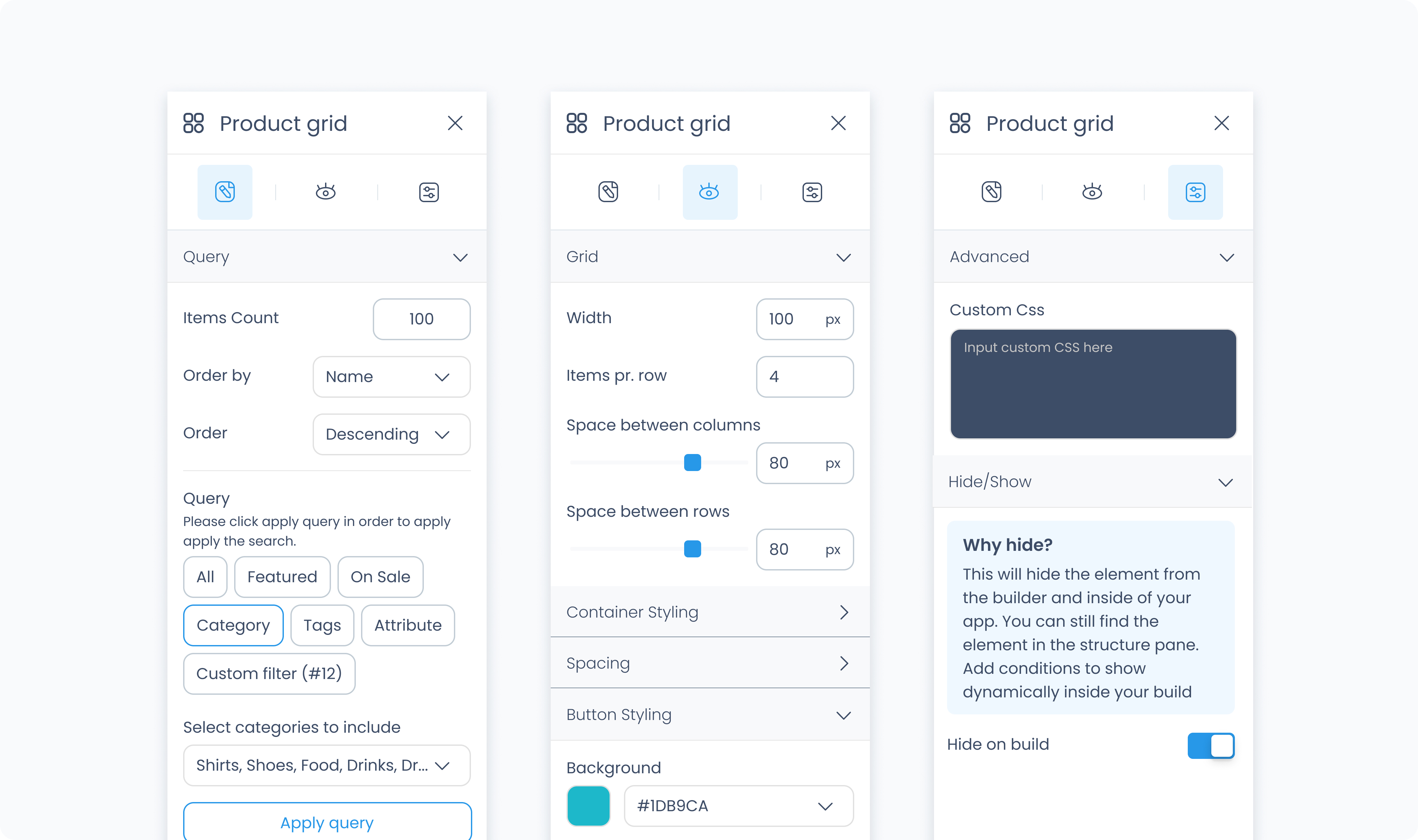
The Editor tab controls how products are pulled into the grid and filtered.
Order by – Choose how products are sorted (e.g., by Name or Price).
Order – Select whether the sort order is Ascending or Descending.
Query filter – Choose whether to show all products, only those on sale, or products in specific categories.
Select categories to include – If using category filters, select one or more categories to include in the grid.
The grid will automatically switch to the No Products view if no products match your filters.
You cannot attach actions to the Product Grid itself. To create interactions, attach actions directly to the Product Divs inside the grid. You can define separate behaviors for Simple and Variable products by selecting each type in the Structures tab and designing them individually.
The Styler tab controls how the Product Grid appears in your layout. You can adjust column layout, spacing, background color, borders, and more.
Aside from styling the grid itself, each tile (Product Div) inside the grid can be styled independently, just like a normal Div Container.
At the top of the Styler tab, you can define how the grid appears in different states:
Default – Normal appearance
Hover – When hovered over
Active – When tapped or clicked
Disabled – When the grid is inactive
Each state can have its own set of styles.
Items per row – Controls how many product tiles are shown in a row.
Space between columns – Sets horizontal spacing between tiles.
Space between rows – Sets vertical spacing between tile rows.
Background color – Sets the background behind the entire grid. Supports static, global, and dynamic color values.
Height and Width – Controls how the grid fills space in its parent:
Fill – Expands to fill the available space
Fit – Shrinks to fit content
Scroll – Adds scrollbars when content overflows
Custom – Enter specific pixel or percentage values
Padding – Adds internal space between the grid’s border and its content.
Margin – Adds space between the grid and other elements.
Both can be applied:
Individually per side
Or to all sides at once using Apply all
Radius – Rounds the corners of the grid. Set each corner or use Apply all for uniform rounding.
Styling – Choose which borders to show (all, none, specific sides).
Border width – Set thickness in pixels.
Border color – Supports static, global, or dynamic values.
Border style – Select from solid, dashed, or dotted borders.
Shadows – Adds depth to the grid using drop shadows. You can:
Adjust X and Y offset
Set blur and spread
Choose a shadow color
Use Clear all shadows to remove them
The Advanced tab provides options for adding custom styles to the grid.
Use this field to apply custom CSS rules to the entire product Grid. These styles override any settings configured in the Styler tab. This affects the grid as a whole and not individual tiles within it.
