This element allows customers to complete transactions directly on supported smartphones, without needing external hardware. This is made possible through NFC technology built into compatible iPhones and Android devices.
This element is a standalone payment button with the Tap to Pay action already built in. You can customize its design, fee, discount, tip options, and more. Alternatively, you can use a standard Button element and manually attach the Tap to Pay action to it.
For this element to function correctly, the flow must run on a device that supports built-in NFC, and the active Company must have their Final Pay account fully set up.
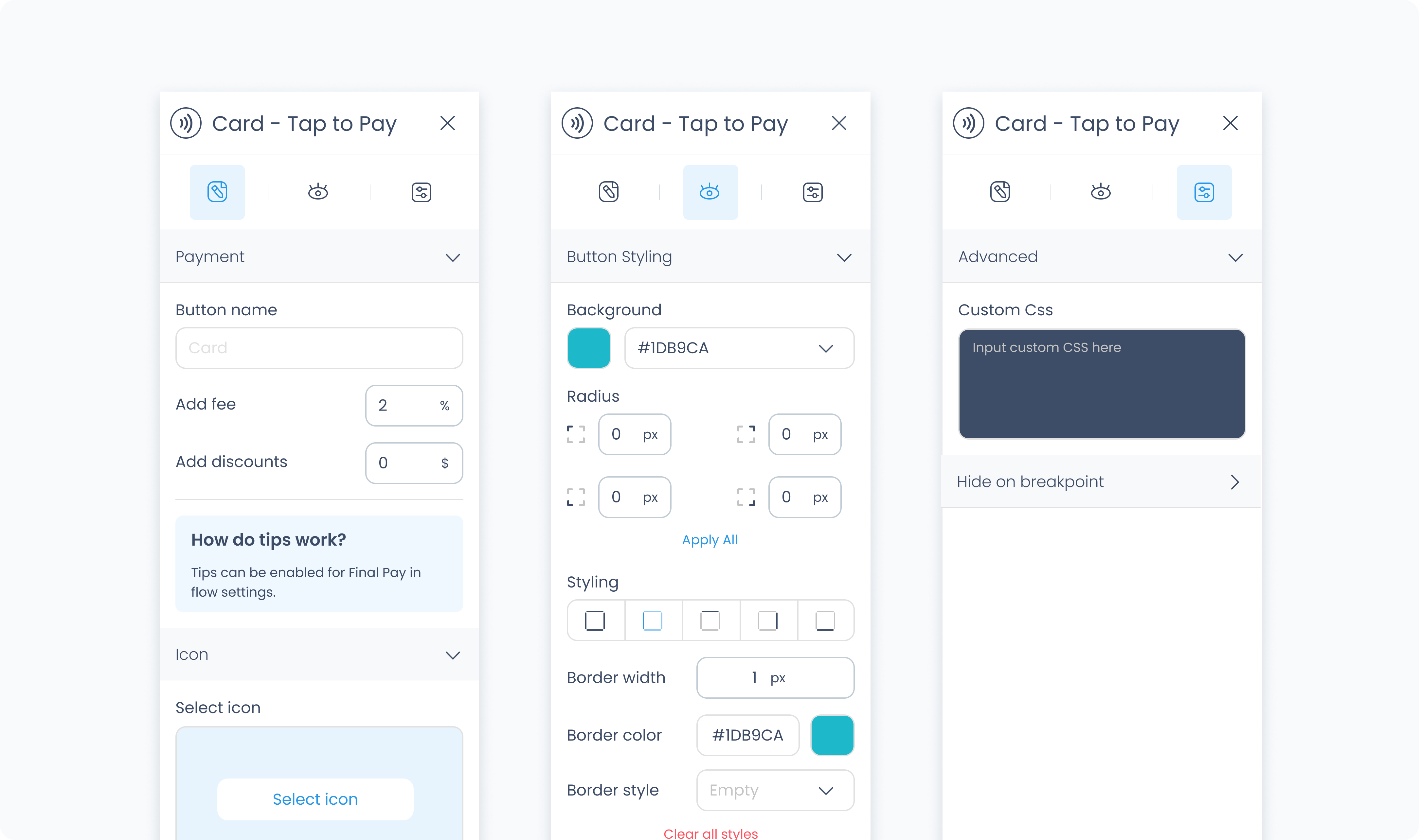
The editor tab lets you configure how the Tap to Pay button appears and behaves.
Button text
Customize the label shown on the button (e.g., “Tap to Pay”).
Add fee / Add discount
Apply an optional fee or discount to the transaction triggered by this button.
Request tips?
Enable tipping before payment. Once activated, you'll see the following options:
Tip presets – Define up to three preset tip amounts with custom labels.
Allow custom tips – Toggle whether users can enter their own tip amount.
Allow no tips – Decide whether the customer must leave a tip or can opt out.
Select a visual icon for the button from the icon library.
Use the Styler tab to customize the visual appearance of the button.
Content direction: Choose the arrangement of icon and text — either horizontally (side-by-side) or vertically (stacked).
Gap: Adjust spacing between icon and label.
Background color: Set the background color of the button using a color picker or hex code input.
Customize the label text inside the button:
Color: Choose a text color.
Alignment: Align text to the left, center, right, or justify.
Font size: Set the font size using a slider or pixel input.
Text font: Choose a font family.
Font weight: Define the font thickness (e.g., 300, 400, 600).
Height and Width: Choose between predefined options like Fit, Fill, or Custom. If custom is selected, you can input specific dimensions in pixels.
Padding: Set the internal spacing between the button content and its border.
Margin: Set external spacing around the button.
Radius: Set the roundness of the button's corners (individually or using “Apply All”).
Styling: Choose a border layout (full, top only, etc.).
Border width: Specify thickness in pixels.
Border color: Choose a border color.
Border style: Select between solid, dashed, or dotted lines.
Use Add shadow to apply visual depth or elevation to the button.
These settings apply to the icon displayed within the button:
Size: Adjust icon size.
Rotate: Set the rotation degree of the icon.
Color: Define the icon’s color.
The Advanced Settings tab provides tools for more complex use cases, such as fine-tuned styling.
You can define custom CSS rules to override or extend the button’s styling.
