The Button element is used to manually trigger actions in your flow, such as navigating to another screen, opening a pop-up, or applying a discount. When you add a button to the canvas, the action menu automatically appears to help you connect it to a behavior right away.
Buttons can contain a text label and an optional icon, but they are not containers and cannot hold other elements. If you need to include multiple nested elements, like combining more than one icon, you should use a Div container instead and attach an action to it.
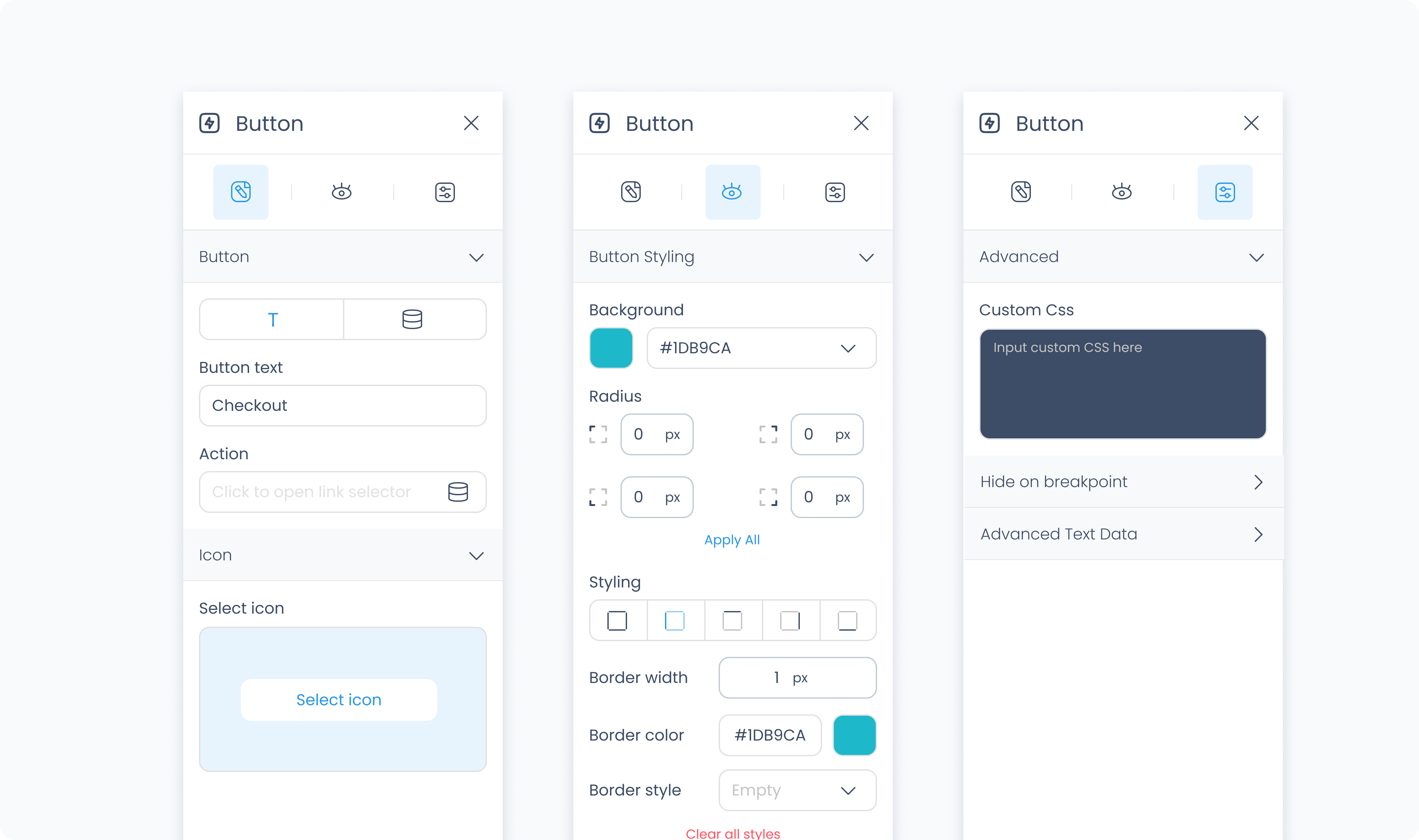
The Editor tab lets you define the text shown on the button, optionally connect it to a dynamic value, assign an action, and add an icon.
Use the Button section to enter static text or bind the button label to a dynamic value.
Use the Action section (lightning icon) to link an existing action or create a new one. This allows the button to trigger behaviors like navigating to another page, opening a pop-up, or triggering a dialog box when tapped or clicked.
Use the Icon section to add a visual icon inside the button. Click "Select icon" to choose from the icon library.
The Styler tab controls the appearance of the button. You can adjust its layout, background, typography, size, spacing, borders, shadows, and icon styling.
At the top of the Styler tab, you can define how the element appears in different states:
Default – Normal appearance
Hover – When hovered over
Active – When tapped or clicked
Disabled – When the element is inactive
Each state can have its own set of styles.
Content direction – Set whether the text and icon appear side by side (horizontal) or stacked (vertical)
Gap – Sets the space between the icon and text inside the button. Accepts values in pixels or percentages
Background color – Sets the button’s background fill. You can use a static color, a global color, or a dynamic value.
Color – Sets the text color.
Alignment – Aligns the text within the button (left, center, right, or justify).
Font size – Use the slider or input to define the size of the text.
Text font – Select the font family to use for the button label.
Font weight – Choose how bold or light the text appears.
Height and Width – Control how the button fills space in its parent container.
Fill – Expands to fill the available space.
Fit – Shrinks to fit the content.
Custom – Define a specific value using pixels or percentages.
Scroll – Enables scrolling if the button’s content exceeds the available space.
Padding – Adds space inside the button, between its content and its outer edge. You can set each side individually or apply the same value to all.
Margin – Adds external spacing around the button to separate it from nearby elements.
Radius – Rounds the corners of the button. Set each corner individually or use Apply all for uniform rounding.
Styling – Choose which sides have visible borders (all, none, top only, etc.).
Border width – Sets the thickness of the border in pixels.
Border color – Pick a static color, or use a global or dynamic value.
Border style – Choose from solid, dashed, or dotted borders.
Shadows – Adds visual depth behind the button. Use the shadow controls to:
Set X and Y offset values to move the shadow horizontally or vertically
Adjust Blur to soften or sharpen the shadow edges
Set Spread to control how far the shadow extends outward
Change the shadow color
Use Clear all shadows to remove them
Size – Adjusts the size of the icon in pixels.
Rotate – Rotates the icon by degrees.
Color – Sets the icon color.
The Advanced Settings tab provides tools for more complex use cases, such as dynamic behavior or fine-tuned styling.
You can define custom CSS rules to override or extend the button’s styling.
These settings are available when the text is connected to a dynamic value.
Prepend – Adds static text before the dynamic value (e.g., “In stock:”)
Append – Adds static text after the dynamic value (e.g., “units available”)
Conditional visibility lets you control when the button appears, disappears, or becomes disabled based on logic.
To use:
Turn on conditions
Define your rule and set the desired behavior
