The Cash Button is a specialized payment element used to process cash transactions in your flow. This element has the Cash Payment action built into it. Alternatively, you can use a regular Button element and manually attach a Cash Payment action to it.
This element also provides built-in support for rounding rules, optional fee or discount adjustments, and a toggle for showing a change calculator. A cash button option is already built into the Payment Grid element by default, but if you want to offer it as a standalone payment method, you can use the Cash Button element directly.
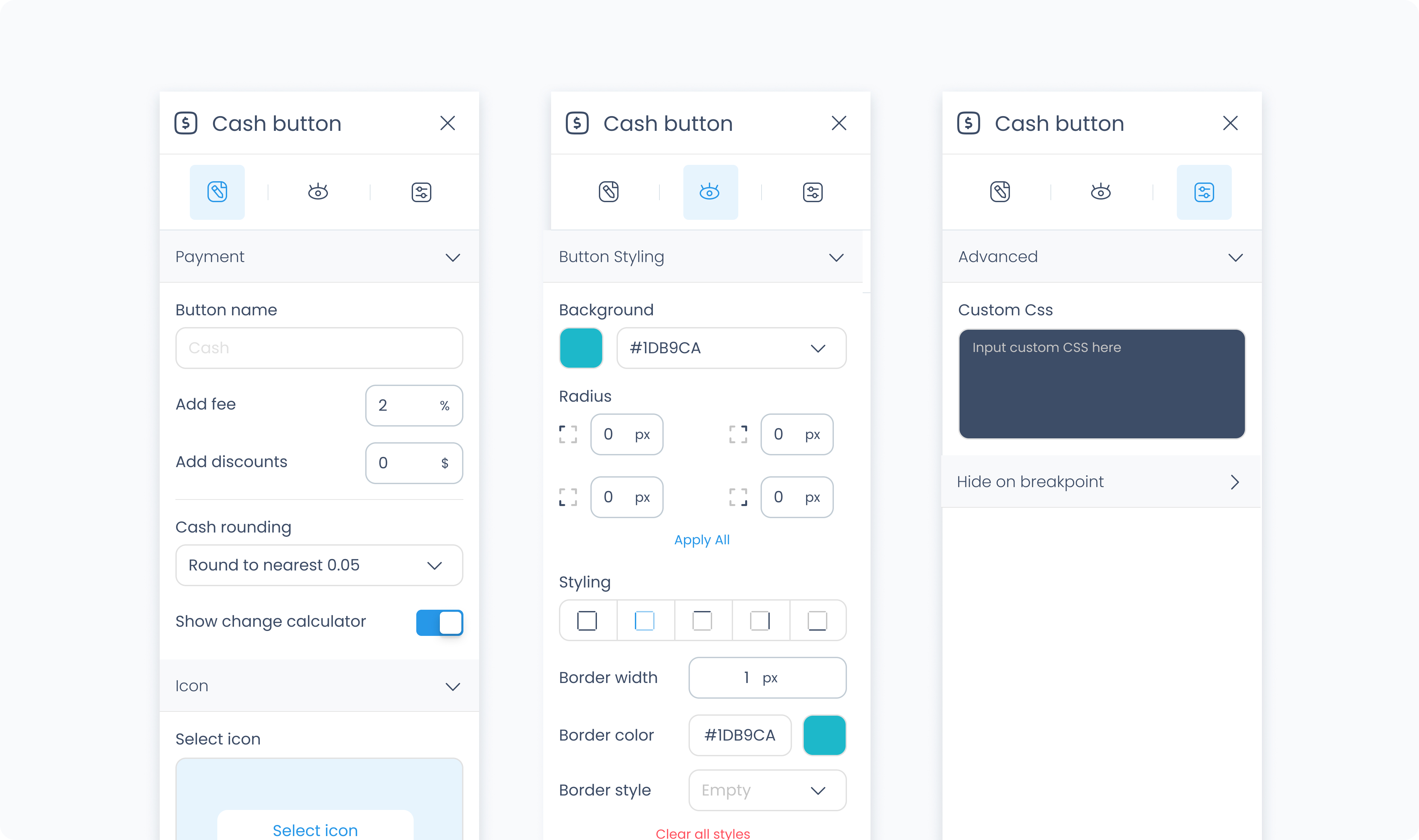
The editor tab lets you configure the text displayed on the button, apply fixed fees or discounts, enable tipping, rounding rules, and more.
Set the label that appears on the button. This is often "Cash", but you can rename it to suit the needs of the flow or region.
Optionally apply a fee when this button is used. Enter a static amount that will be added to the transaction total.
Optionally apply a discount when this button is used. Enter a static amount that will be subtracted from the transaction total.
Choose how the total amount should be rounded for cash handling:
Do not round – No rounding is applied.
Round to nearest 0.05 – Rounds to the nearest five cents.
Round to nearest 0.10 – Rounds to the nearest ten cents.
Round to nearest 0.25 – Rounds to the nearest quarter.
When enabled, the POS will display a calculator for entering the amount received from the customer and automatically compute the change due.
Use this section to assign a visual icon to the button. You can pick an icon from the system library to make the button easier to identify on screen.
Use the Styler tab to customize the visual appearance of the Cash Button.
Content direction: Choose the arrangement of icon and text — either horizontally (side-by-side) or vertically (stacked).
Gap: Adjust spacing between icon and label.
Background color: Set the background color of the button using a color picker or hex code input.
Customize the label text inside the button:
Color: Choose a text color.
Alignment: Align text to the left, center, right, or justify.
Font size: Set the font size using a slider or pixel input.
Text font: Choose a font family.
Font weight: Define the font thickness (e.g., 300, 400, 600).
Height and Width: Choose between predefined options like Fit, Fill, or Custom. If custom is selected, you can input specific dimensions in pixels.
Padding: Set the internal spacing between the button content and its border.
Margin: Set external spacing around the button.
Radius: Set the roundness of the button's corners (individually or using “Apply All”).
Styling: Choose a border layout (full, top only, etc.).
Border width: Specify thickness in pixels.
Border color: Choose a border color.
Border style: Select between solid, dashed, or dotted lines.
Use Add shadow to apply visual depth or elevation to the button.
These settings apply to the icon displayed within the Cash Button:
Size: Adjust icon size.
Rotate: Set the rotation degree of the icon.
Color: Define the icon’s color.
The Advanced Settings tab provides tools for more complex use cases, such as fine-tuned styling.
You can define custom CSS rules to override or extend the button’s styling.
