The Payment Grid element displays all available payment methods for a Company, based on their plan and extension setup. It’s especially useful when building flows intended to be reused across multiple Companies, each with their own payment method configurations.
By using this element, you enable each Company to manage which payment buttons appear in the flow by editing the payment settings in the flow data. If a payment method requires additional extensions, the Company can install them from the Extension Store in Manage, provided those extensions are available in their plan.
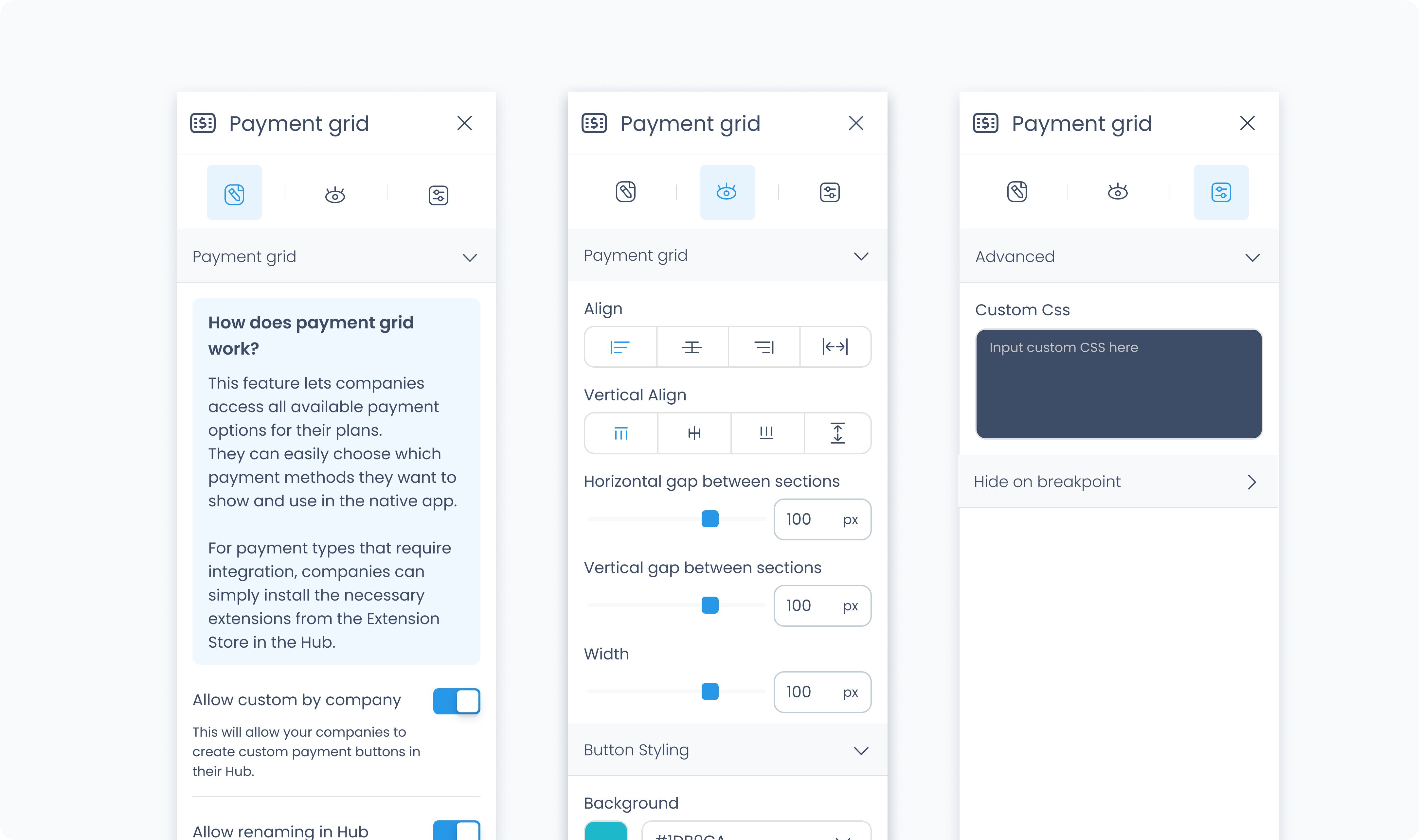
The Editor tab lets you define how the grid behaves and which types of payments can be managed by Companies.
Allow custom by company – When enabled, Companies can create custom payment buttons while configuring the flow data.
Allow renaming – When enabled, Companies can rename any of their available payment buttons while configuring the flow data.
The Styler tab controls the appearance and layout of the Payment Grid and its individual payment buttons. You can adjust grid spacing, button styling, borders, shadows, and typography.
At the top of the Styler tab, you can select which state you’re styling:
Default – Normal appearance
Hover – When the user hovers over a button
Active – When the button is tapped or clicked
Disabled – When the button is unavailable
Each state supports its own styles.
Use these controls to define how the Payment Grid itself is structured:
Height – Choose Fit, Fill, Scroll, or Custom. Use Custom to set an exact height in pixels.
Width – Choose Fit, Fill, or Custom. Use Custom to enter a specific width value.
Space between columns – Adds horizontal spacing between each button.
Space between rows – Adds vertical spacing between each row of buttons.
These settings control the appearance of the payment buttons themselves:
Background color – Set a background color for each button. Supports static, global, and dynamic color values.
Typography color – Sets the text color inside each button.
Alignment – Adjust horizontal alignment of the button’s content (left, center, right, etc.).
Font size – Set the size of the button label text.
Text font – Choose a font family for the button text.
Font weight – Set the text thickness (e.g. 300, 400, 600, etc.).
Radius – Round the corners of the button. Set each corner individually or use Apply all for uniform rounding.
Styling – Choose which sides of the button should have visible borders.
Border width – Set the border thickness.
Border color – Define the border color.
Border style – Choose from solid, dashed, or dotted.
Shadows – Add depth to the button using shadows. You can:
Set horizontal and vertical offset
Adjust blur and spread radius
Choose shadow color
Use Clear all shadows to remove them
These settings control spacing inside and around each button:
Padding – Adds inner spacing between a button’s edge and its content. Useful for increasing touch area or breathing room.
Margin – Adds outer spacing between the button and other elements around it.
The Advanced Settings tab provides tools for more complex use cases, such as dynamic behavior or developer-level styling.
You can define custom CSS rules to override or extend the container’s styling. This is useful when you need fine control beyond what the Styler panel offers.
