The Customer List is a repeater-based element that displays customers from your store in a list layout. It automatically generates a tile for each customer based on the connected data source and any filters you apply. Each tile is a Div Container that you can fully customize by adding other elements into it. Any dynamic data added to a tile will automatically reference the corresponding customer. After you design one tile, Builder will apply that design to all others in the list.
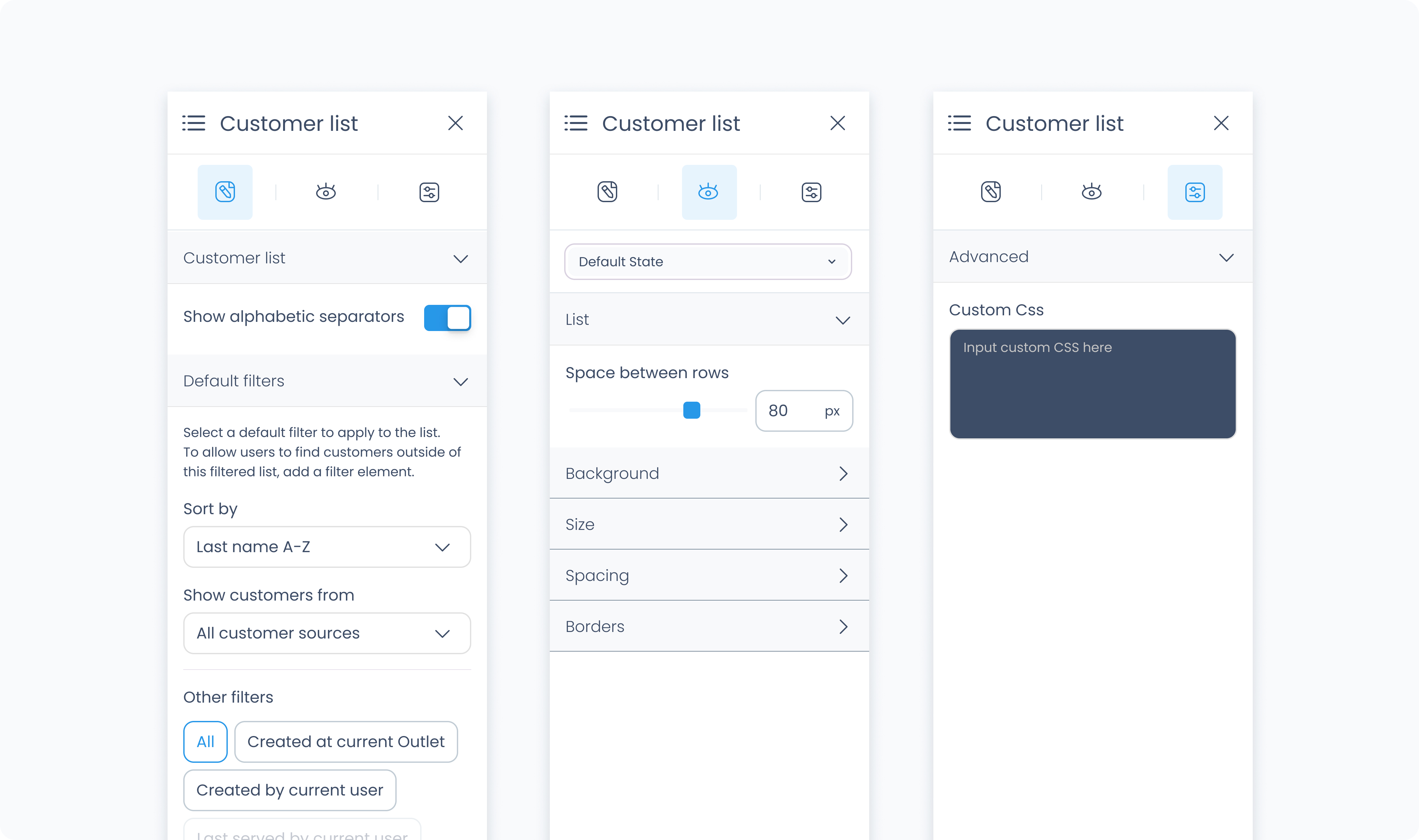
The Editor tab lets you configure how the Customer List queries and displays customers from your store.
Sort by – Select whether to sort customers by first name or last name.
Order – Choose ascending (A–Z) or descending (Z–A) order for the list.
Show customer sources – Filter the list by customer source, such as POS only or 3rd-party synced only.
Customer activity filters – Narrow results based on activity or creation context:
All customers
Created at current Outlet
Ever active at current Outlet
Any activity in the last 12 months
These filters work together to define which customers appear in the list and how they’re organized.
The styler tab controls the visual layout and styling of the Customer List element. You can configure spacing, borders, shadows, size, and background color. This affects how the entire list appears in your flow.
Aside from styling the list itself, each tile inside the list can be styled independently, just like a normal Div Container.
At the top of the Styler tab, you can define how the list appears in different states:
Default – Normal appearance
Hover – When hovered over
Active – When tapped or clicked
Disabled – When the list is inactive
Each state can have its own styling applied.
Space between rows – Defines vertical spacing between customer rows in the list. You can use px or % units.
Background Color – Apply a solid background color to the list. Supports static, global, and dynamic values.
Height and Width – Controls how the list fills space in its parent:
Fill – Expands to fill the parent container
Fit – Shrinks to match the content
Scroll – Enables scrollbars if content exceeds size
Custom – Set a fixed pixel or percentage value
Spacing controls the outer and inner space of the element:
Padding – Adds space inside the element (between the content and border).
Margin – Adds space outside the element (between this and surrounding elements).
You can apply padding and margin:
Per side (top, right, bottom, left)
Or use Apply All to apply the same value everywhere
Radius – Rounds the corners of the grid. Set each corner or use Apply all for uniform rounding.
Styling – Choose which borders to show (all, none, specific sides).
Border width – Set thickness in pixels.
Border color – Supports static, global, or dynamic values.
Border style – Select from solid, dashed, or dotted borders.
Shadows – Adds depth to the grid using drop shadows. You can:
Adjust X and Y offset
Set blur and spread
Choose a shadow color
Use Clear all shadows to remove them
Controls how date dividers in the list (such as “July 23, 2025”) are styled.
Color – Choose a static, global, or dynamic text color.
Alignment – Align the divider text to the left, center, or right.
Font Size – Use the slider or type in a pixel value for the font size.
Text Font – Choose from available fonts such as Poppins.
Font Weight – Set how bold or light the font appears.
Adjusts how much space surrounds each divider line and text.
Padding – Controls space inside the divider container (around the text and line).
Margin – Controls space outside the divider container (between other elements or rows).
You can set spacing individually or apply values to all sides at once using Apply all.
Controls the style of the line shown beneath each date divider.
Radius – Round the corners of the line.
Styling – Choose which borders are applied (top only, bottom only, all sides, etc.).
Border Width – Set the thickness of the divider line.
Border Color – Pick the line color using static, global, or dynamic values.
Border Style – Choose between solid, dashed, or dotted.
Apply drop shadows behind the divider line for extra depth or contrast. Adjust shadow direction, blur, spread, and color. Use Clear all shadows to remove them completely.
The Advanced tab provides options for adding custom styles to the customer list.
Use this field to apply custom CSS rules to the entire customer list. These styles override any settings configured in the Styler tab. This affects the list as a whole and not individual tiles within it.
