The Product Variations element lets the user choose one of the available variations for a variable product.
If the user triggers an Add Product to Cart action without using this element, the system will automatically add the first available variation of the selected active product by default. Including this element ensures that users can choose a specific variation of the selected product before proceeding.
This element only displays variation options for variable products, and it will be empty for simple ones.
The Editor tab controls the content and text for the variation selector.
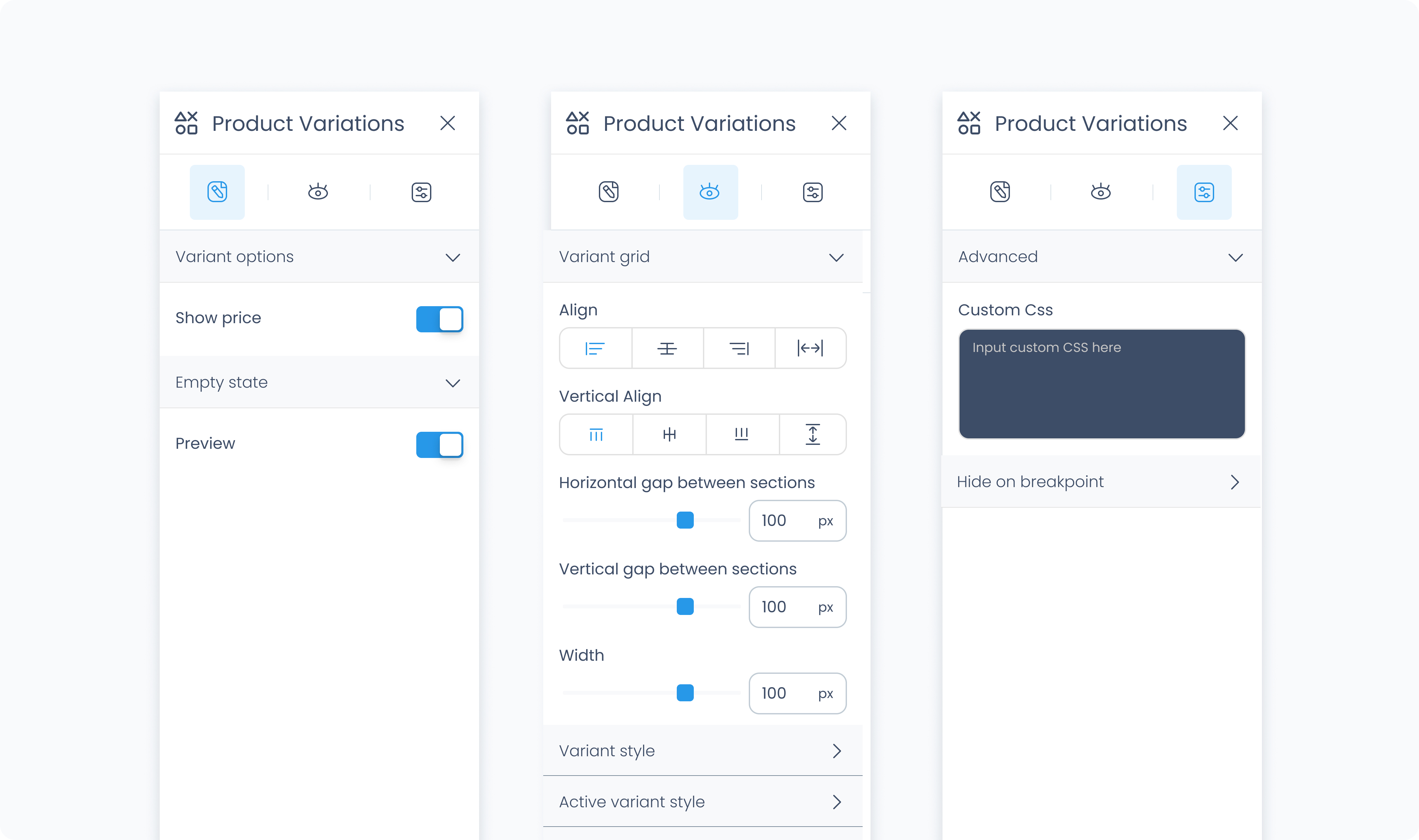
Toggles whether the variation price appears beside each option.
Let’s you define placeholder text that appears before a variation is selected (e.g., “Select variation”).
The Styler tab controls how the Product Variations element appears within the layout. It allows you to configure grid alignment, variant styling, spacing, typography, and more.
Just like other elements, you can define different appearances for each state:
Default – Normal appearance
Hover – When hovered over
Active – When clicked or selected
Disabled – When inactive or unavailable
Each state has its own customizable styling.
Controls the layout of the entire group of variation options.
Align – Aligns variation items to the left, center, or right.
Variant gap – Sets spacing between each variation item.
Section gap – Sets spacing between different option groups (e.g., color, size).
Width – Controls the total width of the entire grid.
This section controls how each individual variation option (like size or color choices) appears in the grid.
Background color – Sets the background color for each variant tile. Supports static, global, and dynamic values.
Radius – Rounds the corners of the tile. You can enter values individually or use Apply all for uniform rounding.
Styling – Choose which sides have visible borders (e.g., all, top-only, none).
Border width – Set the thickness of the border in pixels.
Border color – Use a static color or pull from global or dynamic values.
Border style – Select from solid, dashed, or dotted borders.
Shadows – Adds depth behind the tile. Adjust X/Y offset, blur, spread, and color. Use Clear all styles to reset.
Padding – Adds internal spacing inside each variant tile.
Color – Sets the text color used in each tile.
Alignment – Align the variant text to the left, center, or right.
Font size – Controls the size of the variant text.
Font family – Choose the font for the text.
Font weight – Adjust the weight (e.g., 300, 500, 700) for emphasis.
Controls the outer container’s background appearance.
Background color – Sets the background for the full Product Variations element. Accepts static, global, and dynamic colors.
Manage space inside and around the Product Variations block.
Padding – Adds space inside the outer edge of the element.
Margin – Adds space outside the element relative to other blocks.
You can apply spacing to individual sides or all at once using Apply all.
Customize the outer edge of the entire Product Variations element.
Radius – Rounds the corners of the full container. Set each corner independently or use Apply all.
Styling – Choose which sides of the border are visible.
Border width – Set the border thickness in pixels.
Border color – Pick a static, global, or dynamic color.
Border style – Choose from solid, dashed, or dotted.
Shadows – Add a drop shadow to the entire block for visual depth. Use the standard shadow controls or Clear all styles to reset.
Controls styling for the title section of the variation group (e.g. "Size", "Color").
Color – Text color for the title.
Alignment – Align the title left, center, or right.
Font size – Sets the title’s font size.
Font family – Choose the font used.
Font weight – Sets the weight/thickness of the title text.
Controls how the names of each variation group appear.
Color – Sets the text color for the group label.
Alignment – Adjust horizontal alignment (left, center, right).
Font size – Choose a pixel size for the text.
Font family – Select a font for the group label.
Font weight – Controls the text weight.
The Advanced tab provides options for adding custom styles to the Product Variations.
Use this field to apply custom CSS rules to the entire element. These styles override any settings configured in the Styler tab.
