The Print Button sends a selected print block to a connected printer when tapped. It is commonly used to print receipts, labels, or order confirmations during a flow.
If you want to trigger printing automatically after each sale, without adding a button in the flow, you can configure it in Run Native after signing in and selecting the flow.
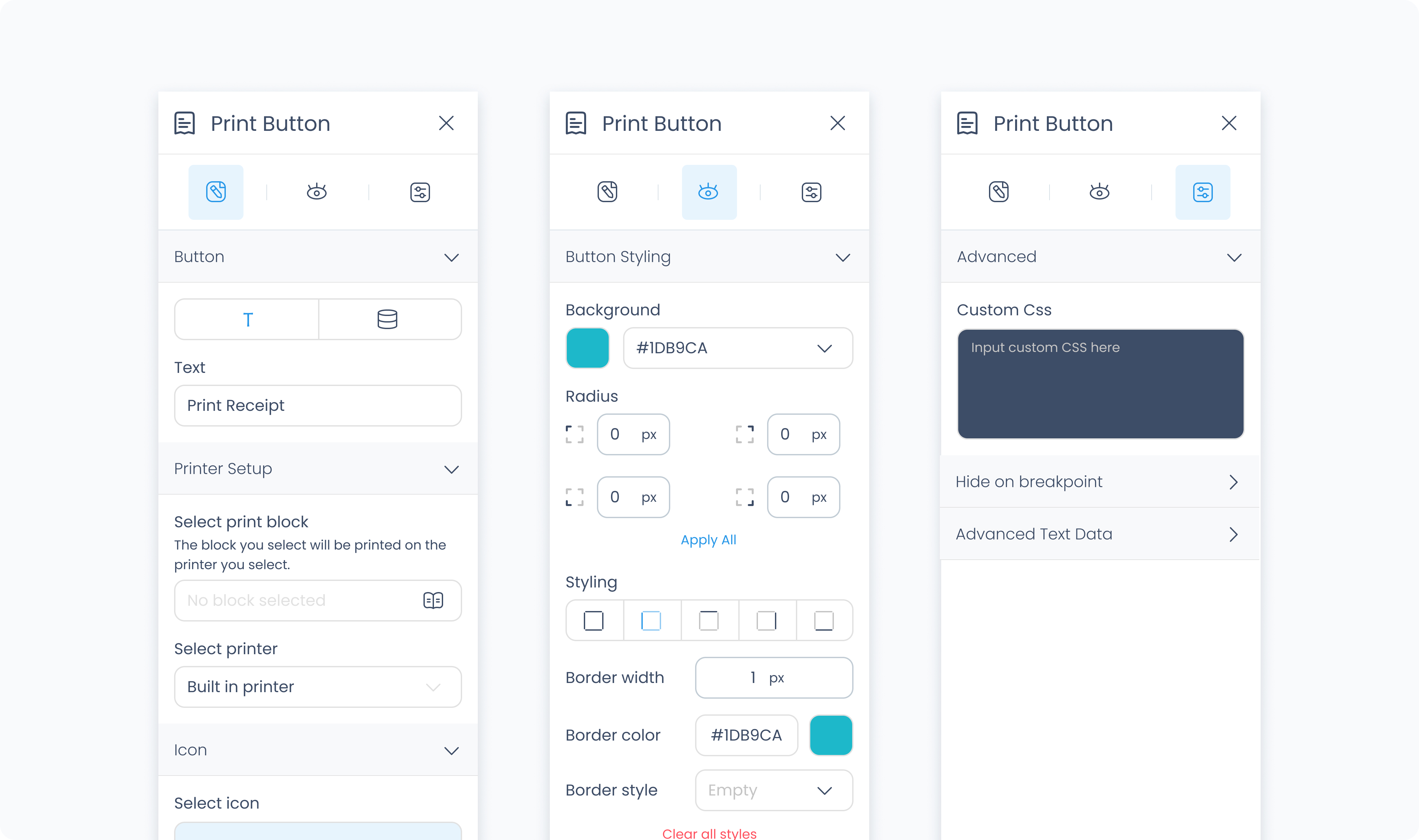
The Editor tab controls what the button displays and which block it sends to the printer.
Input text – Sets the label displayed on the button. You can enter a static value or bind dynamic data.
Text/data toggle – Switch between static input and dynamic binding.
Select print block – Choose which Print Block is triggered when the button is tapped. You can view all the print blocks you have access to in your build.
Select icon – Adds an icon next to the button label to reinforce its function.
The Styler tab controls how the button looks and behaves in your layout. You can adjust layout, background, typography, size, spacing, borders, shadows, and icon styling.
Content direction – Choose whether the icon and text are arranged horizontally or vertically.
Gap – Controls the space between the icon and the text.
Background color – Sets the button’s background color using a static, global, or dynamic value.
Color – Sets the text color.
Alignment – Align text left, center, or right.
Font size – Controls the size of the text in pixels.
Text font – Choose the typeface used for the label.
Font weight – Controls how thick the text appears.
Height and width – Controls how the button fills space in its parent:
Fill – Expands to fill the parent container.
Fit – Shrinks to match the content’s dimensions.
Custom – Set specific pixel or percentage values.
Padding – Adds space inside the button, between its content and border. You can adjust each side independently or use Apply all.
Margin – Adds space outside the button to separate it from surrounding elements.
Radius – Rounds the corners of the button. Set each corner independently or use Apply all for uniform rounding.
Styling – Choose which sides have visible borders (all, none, top only, etc.).
Border width – Sets the thickness of the border in pixels.
Border color – Pick a static color, or use a global or dynamic value.
Border style – Choose from solid, dashed, or dotted borders.
Shadows – Adds visual depth behind the button. Use the shadow controls to:
Set X and Y offset values to move the shadow horizontally or vertically
Adjust Blur to soften or sharpen the shadow edges
Set Spread to control how far the shadow extends outward
Change the shadow color
Use Clear all shadows to remove them
Size – Controls the icon’s size in pixels.
Rotate – Rotates the icon by the specified number of degrees.
The Advanced tab provides additional options for styling and conditional logic.
Apply custom CSS rules to the Print Button. These styles override any configuration made in the Styler tab and affect the entire element.
