The Home Menu Link is a fixed navigation element that always sends users back to the Station Home screen. It is typically placed in a Navigation Menu alongside other links to provide a consistent way to exit the flow. This element includes an icon but cannot display custom text or trigger additional actions.
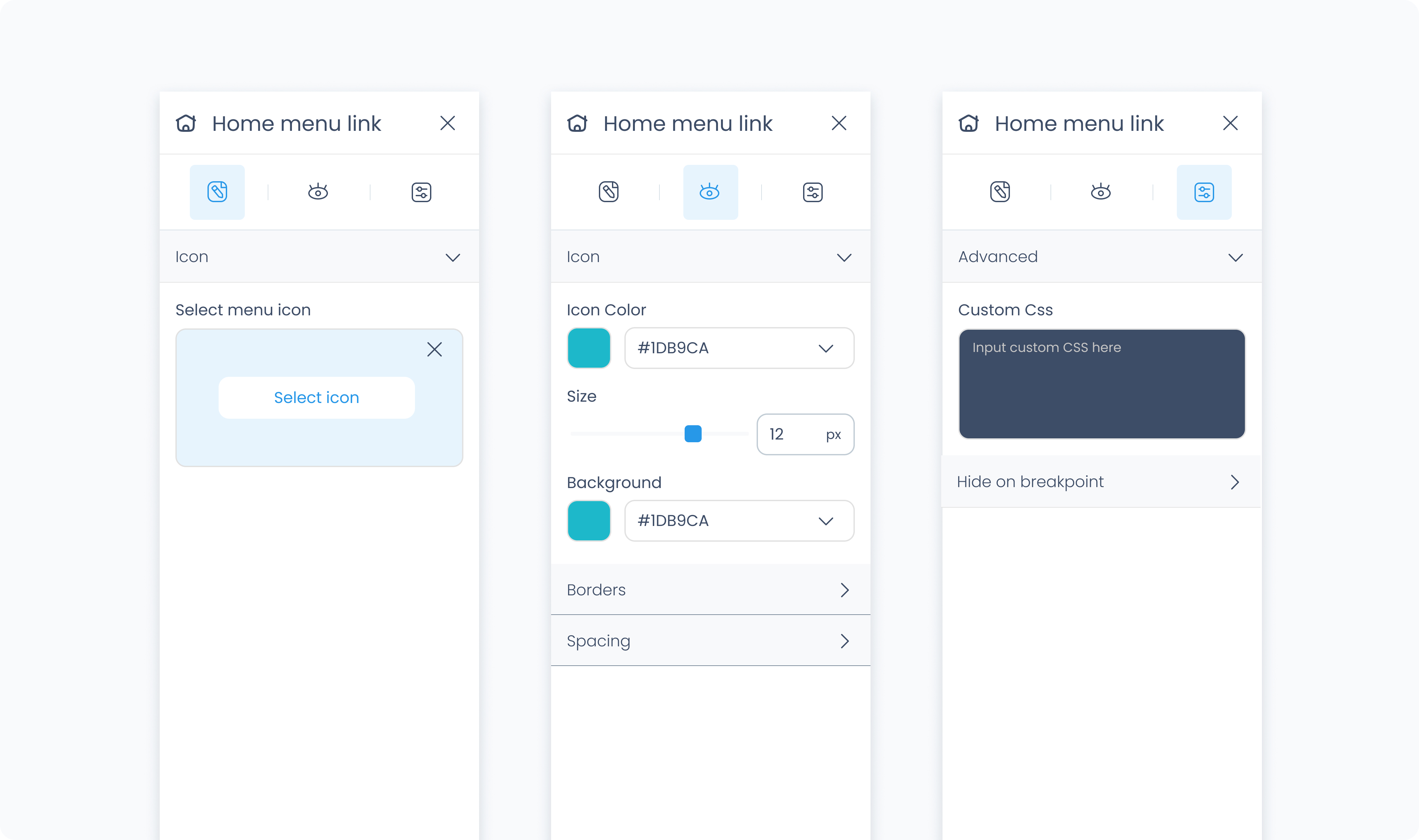
The Editor tab for this element is limited to icon selection, since the Home Menu Link has a fixed action and always directs users to the Station Home screen.
Select icon – Choose a visual symbol to represent the Home Menu Link. This helps users recognize it quickly in your layout.
The Home Menu Link has a built-in action and you cannot link any further actions to it or extend the action with additional steps. If you need to perform additional steps before navigating to Station Home, such as verifying identity in self-checkout or price-checking kiosk scenarios where customer access should be restricted, use a Button element instead. You can then attach an action with two steps: first, authenticate the user; then, redirect them using a Go to Page: Station Home action.
The Styler tab controls the appearance of the Home Menu Link. You can adjust its background, size, spacing, borders, shadows, and icon styling.
Background color – Set the background color of the Home Menu Link. Use a static value or connect to a global or dynamic value.
Height and Width – Controls how the element fills space in its parent:
Fill – Expands to fill the parent container.
Fit – Shrinks to match the content’s dimensions.
Custom – Set specific pixel or percentage values.
Padding – Adds space inside the element, between its border and content. You can define each side separately or apply one value to all sides using Apply all.
Margin – Adds space outside the element, separating it from surrounding elements. Each side can be customized individually or with Apply all.
Radius – Rounds the corners of the element. Set each corner independently or use Apply all for uniform rounding.
Styling – Choose which sides have visible borders (all, none, top only, etc.).
Border width – Sets the thickness of the border in pixels.
Border color – Pick a static color, or use a global or dynamic value.
Border style – Choose from solid, dashed, or dotted borders.
Shadows – Adds visual depth behind the element. Use the shadow controls to:
Set X and Y offset values to move the shadow horizontally or vertically
Adjust Blur to soften or sharpen the shadow edges
Set Spread to control how far the shadow extends outward
Change the shadow color
Use Clear all shadows to remove them
Size – Controls the size of the icon in pixels.
Rotate – Rotates the icon by the specified number of degrees.
Color – Set a static, global, or dynamic color value for the icon.
The Advanced Settings tab provides additional options for customization and conditional visibility.
You can apply custom CSS rules to override or extend the styling of the Home Menu Link. These styles take precedence over any configuration made in the Styler tab.
Hide on layout – Temporarily removes the element from the canvas preview without removing it from the flow.
Conditional visibility lets you control when the Home Menu Link appears, disappears, or becomes disabled based on logic.
To use:
Turn on conditions
Choose the behavior when the condition is met (Show, Hide, or Disable)
Define your rule
