The Final – Terminal element initiates a payment through a compatible Final Terminal device. It supports both Cloud and Bluetooth connection types, depending on your hardware setup.
For this element to function correctly, the flow must be run on a device connected to a Terminal that matches the selected connection type (Bluetooth or Cloud), and the company running the flow must have Final Pay set up.
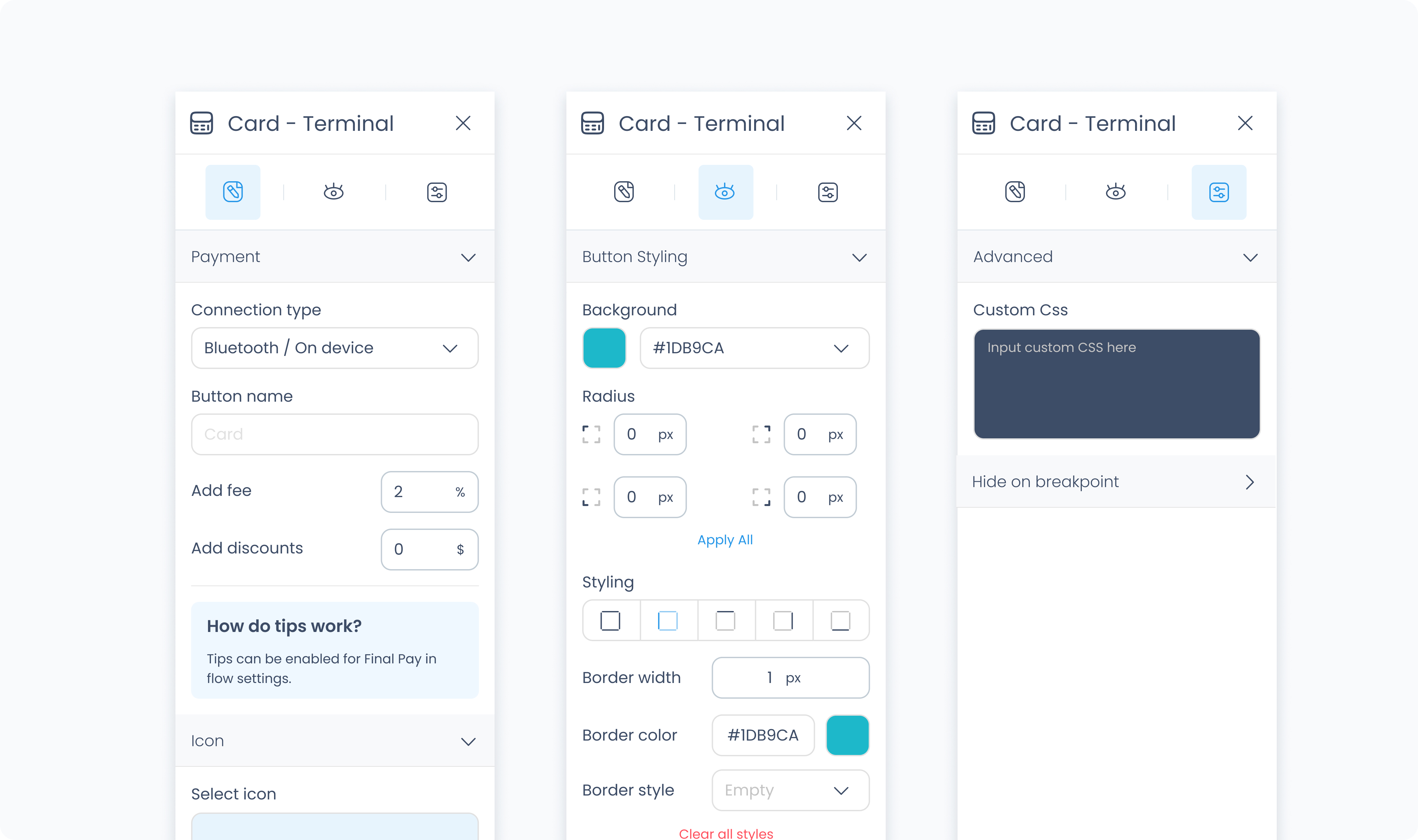
Connection type
Choose between Cloud or Bluetooth to match the terminal connection method expected during the flow. This defines how the payment will be routed through Final Terminal.
Button text
Customize the label that appears on the payment button.
Add fee / Add discount
Optionally apply a fixed fee or discount to the payment triggered by this button.
Request tips?
Enable tipping for this payment method.
Tip amounts
Define up to three fixed tip percentages, each with an optional label (e.g., “Standard”, “Generous”).
Allow custom tips
Toggle whether users can manually enter a tip amount.
Allow no tips
Allow customers to skip tipping entirely.
Select icon
Choose an icon to appear on the button for visual identification.
Use the Styler tab to customize the visual appearance of the button.
Content direction: Choose the arrangement of icon and text — either horizontally (side-by-side) or vertically (stacked).
Gap: Adjust spacing between icon and label.
Background color: Set the background color of the button using a color picker or hex code input.
Customize the label text inside the button:
Color: Choose a text color.
Alignment: Align text to the left, center, right, or justify.
Font size: Set the font size using a slider or pixel input.
Text font: Choose a font family.
Font weight: Define the font thickness (e.g., 300, 400, 600).
Height and Width: Choose between predefined options like Fit, Fill, or Custom. If custom is selected, you can input specific dimensions in pixels.
Padding: Set the internal spacing between the button content and its border.
Margin: Set external spacing around the button.
Radius: Set the roundness of the button's corners (individually or using “Apply All”).
Styling: Choose a border layout (full, top only, etc.).
Border width: Specify thickness in pixels.
Border color: Choose a border color.
Border style: Select between solid, dashed, or dotted lines.
Use Add shadow to apply visual depth or elevation to the button.
These settings apply to the icon displayed within the button:
Size: Adjust icon size.
Rotate: Set the rotation degree of the icon.
Color: Define the icon’s color.
The Advanced Settings tab provides tools for more complex use cases, such as fine-tuned styling.
You can define custom CSS rules to override or extend the button’s styling.
