The Customer Notes element displays a list of notes associated with the currently selected customer. Users can add new notes, view timestamps, and delete existing ones. This element must be placed inside a Customer Section, where other dynamic customer data, such as name, status, or contact details, is displayed. Notes update automatically based on the selected customer.
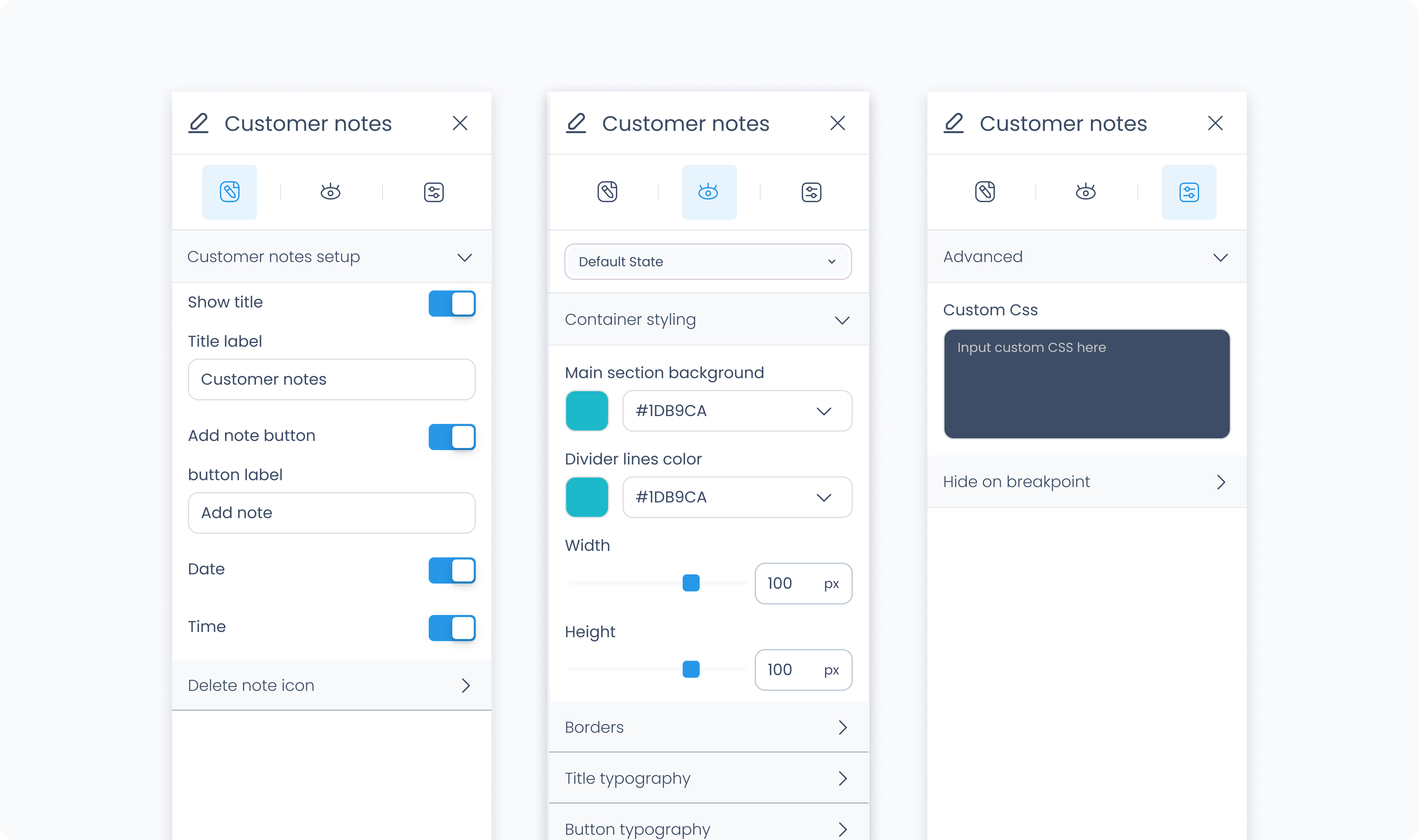
The Editor tab lets you control which note-related features are visible and customizable.
Show title – Toggles the visibility of the section title. You can change the label text.
Show add note button – Adds a button that allows users to create new notes. You can customize the button label.
Show date/time/delete icon – Choose whether to show the timestamp and delete icon on each note.
Button icon – Select which icon appears in the add note button.
Delete note icon – Choose the icon used to remove individual notes.
The Styler tab controls the appearance and layout of the Customer Notes element. You can adjust container styles, note typography, button styles, spacing, and more.
This element must be placed inside a Customer Section to access customer-specific data.
This section lets you define the outer wrapper of the Customer Notes element.
Height – Choose how the container behaves vertically:
Fill – expands to fill its parent.
Fit – shrinks to fit its content.
Width – Define width as Fill, Fit, or use Custom to set a specific pixel value.
Background Color – Set a solid background using a static, global, or dynamic color.
Radius – Round the corners individually or use Apply All for uniform corners.
Styling – Select which sides of the container show borders.
Border Width – Enter a thickness value in pixels.
Border Color – Pick from the color picker or use global/dynamic values.
Border Style – Choose between Solid, Dashed, or Dotted.
Shadows – Add depth by adjusting shadow position, blur, spread, and color.
Padding – Internal spacing between the container and its content. Set per side or apply to all.
Margin – External spacing around the container. Set per side or apply to all.
Controls the appearance of the section title (e.g., "Customer Notes").
Color – Define the title’s text color.
Alignment – Align left, center, right, or justified.
Font Size – Set the size in pixels.
Text Font – Choose from available fonts (e.g., Poppins).
Font Weight – Set the font weight (e.g., 400, 600).
Height / Width – Choose Fill, Fit, or Custom values.
Background Color – Sets button background.
Radius – Rounds button corners individually or uniformly.
Styling – Choose which sides show borders.
Border Width / Color / Style – Control the look of the button’s border.
Shadows – Adds shadow effects behind the button.
Padding – Space inside the button around its label.
Text Color – Sets the label’s font color.
Alignment / Font Size / Font / Weight – Adjusts text placement and appearance.
Controls the separator line between notes.
Background Color – Set the divider color using hex, global, or dynamic value.
Controls the appearance of the date label shown with each note.
Color – Choose a color.
Alignment – Text alignment options.
Font Size – Size in pixels.
Text Font / Weight – Select font family and weight.
Controls how the time label looks. Same options as Date Typography, with a separate color and font styling.
Controls the text style of the actual note content.
Color / Alignment / Font Size / Font / Weight
Styles the delete (X) icon shown beside each note.
Size – Set icon size in pixels.
Rotate – Rotate the icon.
Color – Choose a color for the icon.
The Advanced tab lets you apply custom styles and show/hide logic.
Add your own CSS rules to override styles from the Styler tab.
