The Icon element displays a standalone visual symbol. You can use it to reinforce meaning, guide interaction, or enhance your flow visually. It supports full styling and action linking, but it cannot hold any other elements.
The Editor tab lets you choose which icon to display and optionally assign an action.
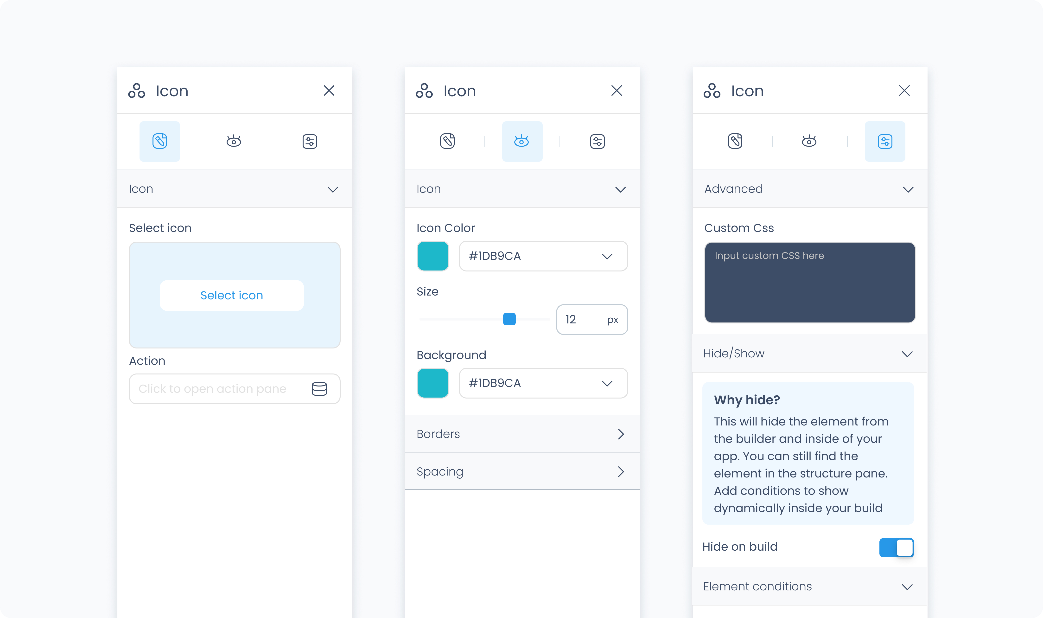
Use the Icon section to select an icon from the available library.
Use the Action section (lightning icon) to link an existing action or create a new one. This allows the icon to trigger behaviors like navigating to another page, opening a popup, or triggering a dialog box when tapped or clicked.
The Styler tab controls the appearance of the icon. You can adjust its size, colour, background, spacing, and borders.
At the top of the Styler tab, you can define how the element appears in different states:
Default – Normal appearance
Hover – When hovered over
Active – When tapped or clicked
Disabled – When the element is inactive
Each state can have its own set of styles.
Size – Adjusts the size of the icon in pixels.
Rotate – Rotates the icon by degrees.
Color – Sets the color of the icon. You can use a static color, a global color, or a dynamic value.
Background color – Applies a background color behind the icon. This can be static, global, or dynamic.
Padding – Adds space inside the icon’s outer edge. You can apply padding to individual sides or use Apply all.
Margin – Adds external spacing between the icon and surrounding elements.
Radius – Rounds the corners of the icon. Set each corner individually or use Apply all for uniform rounding.
Styling – Choose which sides have visible borders.
Border width – Sets the thickness of the border in pixels.
Border color – Pick a static color, or use a global or dynamic value.
Border style – Choose from solid, dashed, or dotted borders.
Shadows – Adds visual depth behind the icon. Use the shadow controls to:
Set X and Y offset values to move the shadow horizontally or vertically
Adjust Blur to soften or sharpen the shadow edges
Set Spread to control how far the shadow extends outward
Change the shadow color
Use Clear all shadows to remove them
The Advanced Settings tab provides tools for custom behavior, visibility control, and fine-tuned styling.
You can define custom CSS rules to override or extend the icon’s appearance. Custom CSS takes precedence over styles set in the Styler tab.
Hide on layout – Temporarily hides the icon from the canvas preview without removing it from the flow. This does not affect conditional visibility.
Conditional visibility lets you control when the icon appears, disappears, or becomes disabled based on logic.
To use:
Turn on conditions
Define your rule and choose what should happen if the condition applies (Show, Hide, or Disable)
