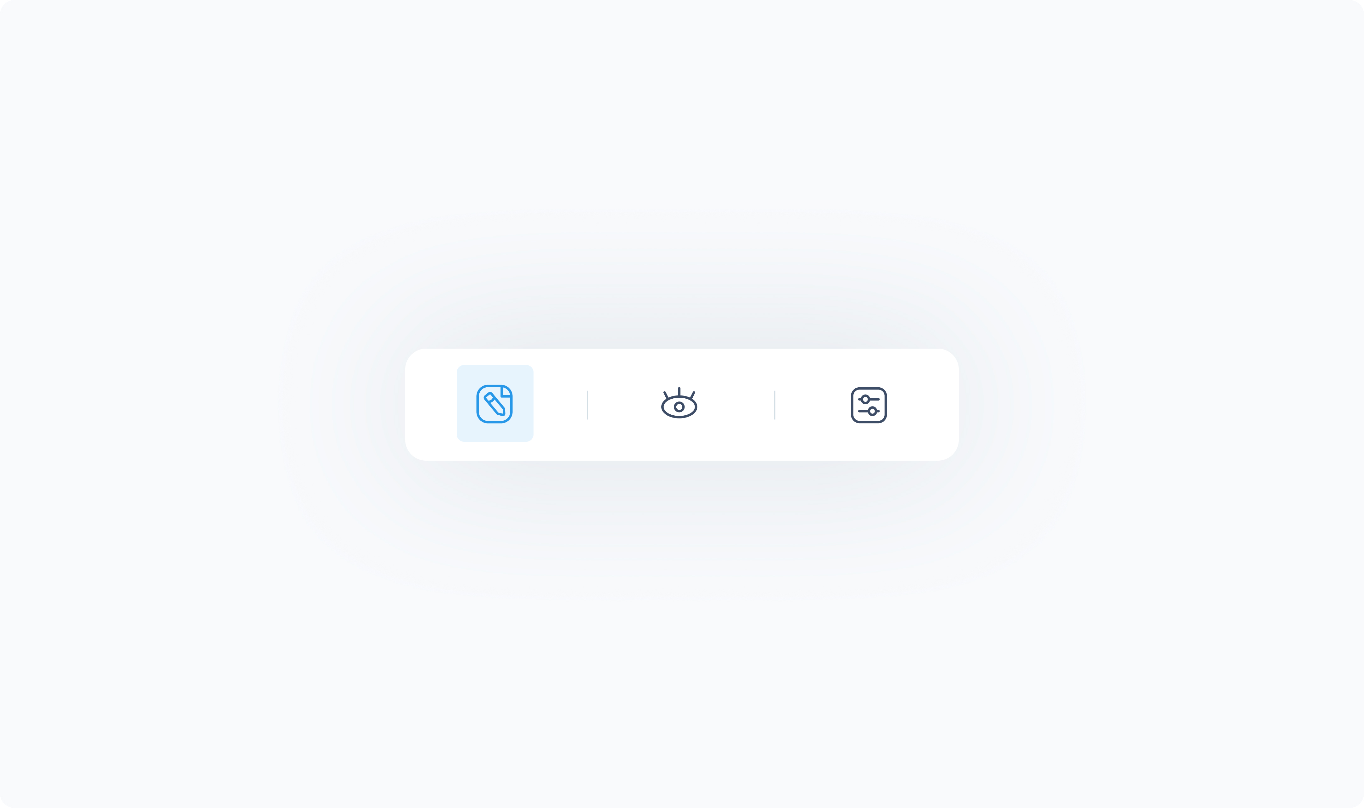
Location: Left side of the element panel (pencil icon)
The Editor tab defines the core behavior, content, and connections of the element. It’s where you set what the element displays, how it behaves, and which other elements or data sources it interacts with.
Available options vary depending on the element.
Common configuration settings include:
Text input or dynamic data binding – Enter static content or bind to dynamic values (e.g., product name, customer email, order total, etc.).
Action – Assign what happens when the element is clicked or tapped (e.g., open Slide Out, navigate, apply discount, etc.).
Target – Link the element to a list or grid (required for elements like Tab Filters, Searchbox, etc.)
Query – Define data source settings for lists and grids
Show/hide options – Toggle visibility of optional parts (e.g., header, close button, label).
Preview controls – Set open or active states in Builder for elements like Slide Outs, Tab Filters, etc.
