The Slide Out element lets you reveal a side panel over your layout. It opens in response to a Toggle Slide Out action and can be styled independently from the rest of your page. Use this element to display content without navigating away from the main view.
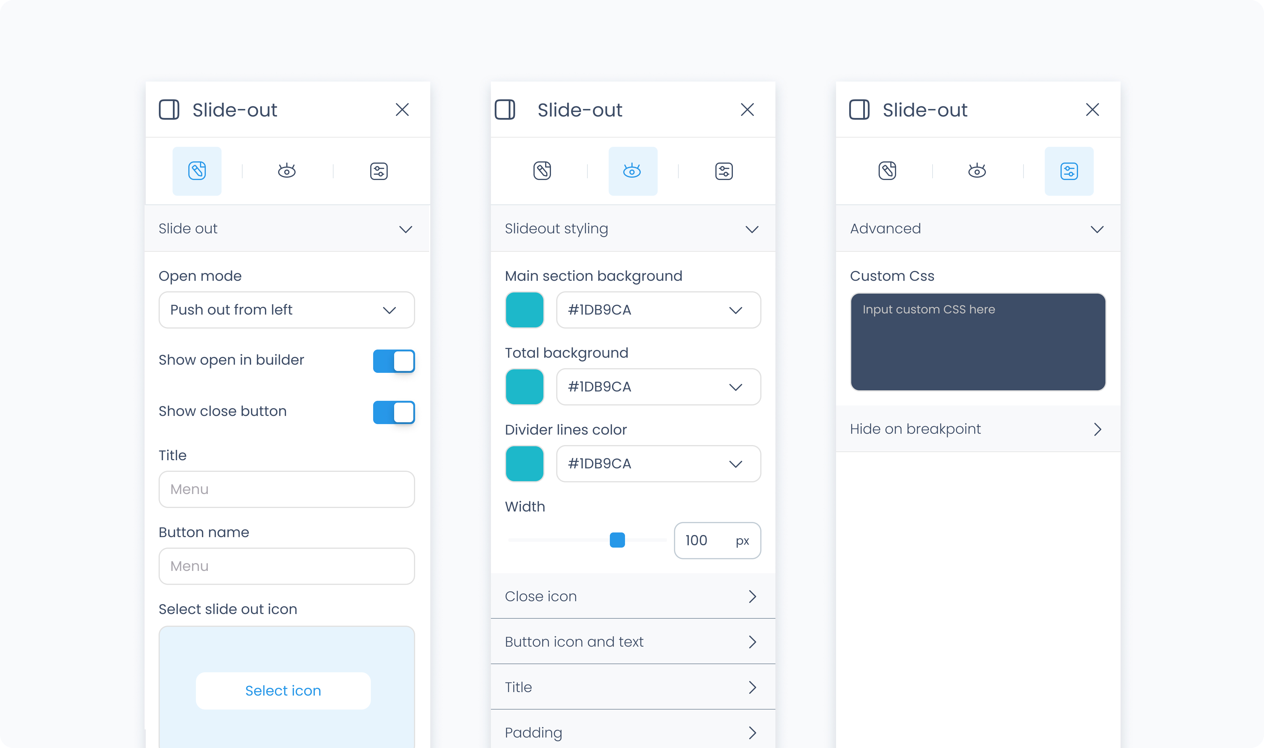
The Editor tab defines how the Slide Out behaves when triggered. You can choose its entry animation, customize the header with a title and icons, and control whether the panel includes a close button.
How to use – Slide Outs are opened and closed using a Toggle Slide Out action. You’ll need to create one and link it to an element like a button or icon.
Open mode – Defines how the panel appears:
Push out from left – Panel slides in from the left and pushes layout right.
Push out from right – Panel slides in from the right and pushes layout left.
Overlay from left – Panel slides over the layout from the left.
Overlay from right – Panel slides over the layout from the right.
Show open in builder – Opens the panel inside Builder for editing and previewing its content.
Title – Optional text shown in the header area.
Show close button – Adds a close icon to the header so users can dismiss the panel manually.
Select icon – Adds a decorative icon to the header title.
Select icon – Choose which icon appears for the close button (if enabled).
The Styler tab controls the appearance and layout of the Slide Out panel. You can style the container, header, and icons independently.
Content direction – Sets whether elements inside the panel are arranged horizontally or vertically.
Align – Horizontally aligns the content within the panel.
Vertical align – Vertically aligns content within the Slide Out.
Gap – Adds spacing between elements placed inside the panel.
Width – Controls how wide the panel appears:
Fit – Shrinks to match the content inside.
Fill – Expands to fill the parent container.
Custom – Enter a specific width in pixels.
Scroll – Enables horizontal scrolling when the content exceeds the specified width.
Padding – Adds internal spacing between the panel’s edge and its content. You can apply it per side or use Apply all.
Margin – Adds external spacing around the Slide Out in the layout.
Radius – Rounds the corners of the panel. Set each corner individually or use Apply all for uniform rounding.
Styling – Choose which sides of the panel have visible borders (e.g., all, top only).
Border width – Sets the thickness of the border in pixels.
Border color – Choose a static, global, or dynamic color.
Border style – Select from solid, dashed, or dotted border types.
Add shadow – Adds depth behind the panel.
X / Y offset – Controls shadow position.
Blur – Softens or sharpens the shadow edges.
Spread – Expands or contracts the shadow size.
Color – Sets the shadow color.
Clear all shadows – Removes the shadow completely.
Background color – Sets the fill color of the Slide Out header area.
Color – Sets the color of the title text.
Alignment – Aligns the title text left, center, or right.
Font size – Controls the size of the title.
Text font – Choose the font family for the header.
Font weight – Adjust how bold or light the title appears.
Padding – Adds internal spacing around the content inside the header.
Radius – Rounds the corners of the header. Set each corner or use Apply all.
Styling – Choose which sides have borders.
Border width – Controls how thick the border appears.
Border color – Sets the color of the border (static, global, or dynamic).
Border style – Select solid, dashed, or dotted lines.
Size – Adjusts the icon’s size in pixels.
Rotate – Rotates the icon by degrees.
Size – Sets the close icon size.
Rotate – Rotates the icon.
Color – Defines the icon’s color. Accepts static, global, or dynamic values.
The Advanced Settings tab provides tools for more complex use cases such as fine-tuned styling.
You can define custom CSS rules to override or extend the elements styling.
