The Dropdown Field element lets users filter a connected list or grid by selecting from a predefined set of options. It’s most commonly used with Order Lists, Product Grids, or Customer Lists to narrow results by fields like status, category, etc. This element must be connected to a filterable data element.
The editor tab allows you to define how the Dropdown Field element behaves and connects to other elements in your flow.
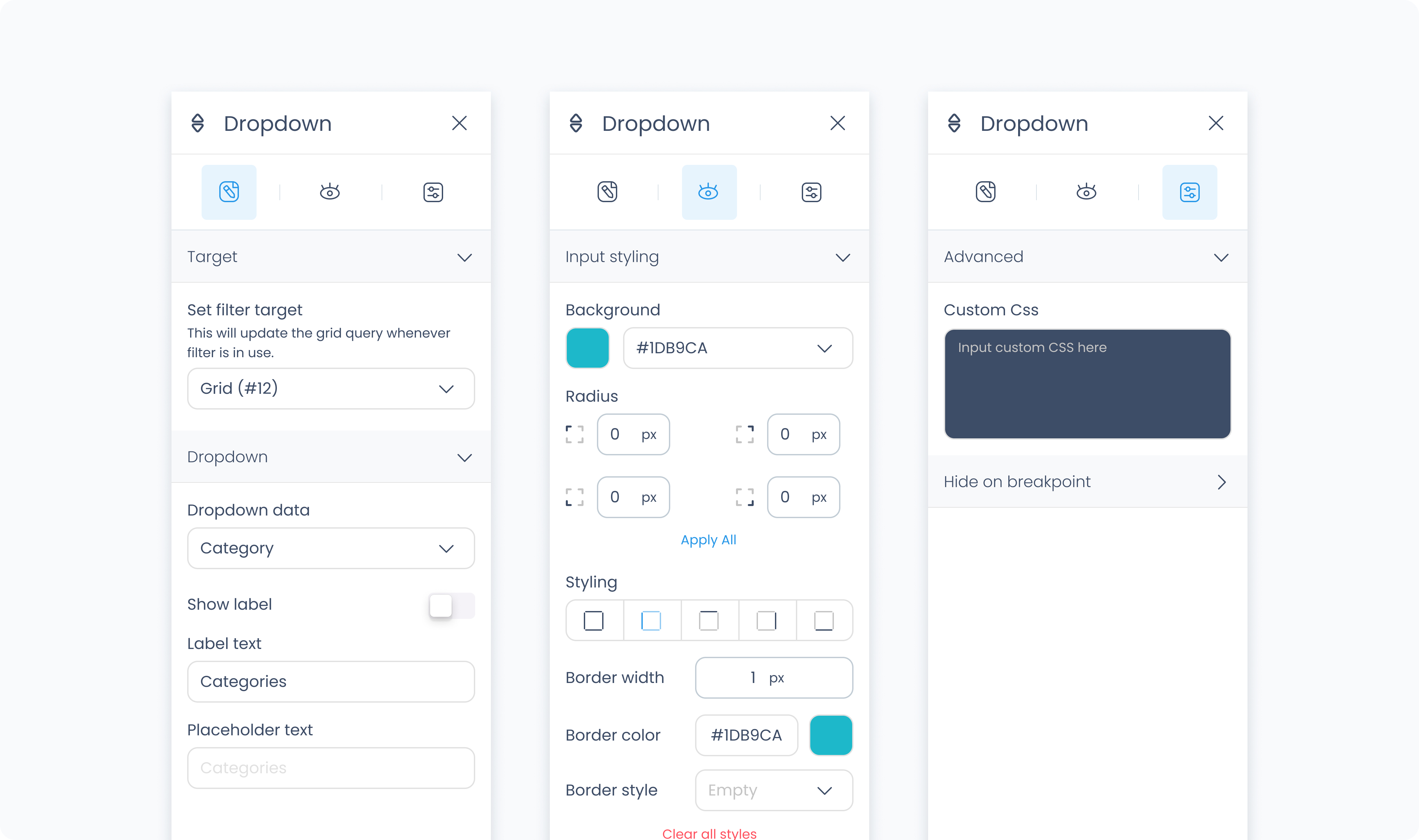
Set filter target – Select which list or grid will be filtered by this dropdown (e.g., Order List #1).
Set active – Displays the dropdown in its active state for preview purposes in Builder. This does not affect the flow’s behavior.
Dropdown data – Choose which field to filter by (e.g., Order Status, Product Category, etc).
Show label? – Toggle to display or hide a label above the dropdown.
Label – Text shown as the field label if enabled.
Input placeholder – Text that appears in the input field before a selection is made (e.g., “All statuses”).
The Styler tab allows you to customize the dropdown’s appearance, including both the input field and the menu options. You can style it for each interaction state, customize borders, padding, spacing, and fonts.
At the top of the Styler tab, you can switch between different interaction states to style how the Searchbox looks in each context:
Default – The normal appearance when the Searchbox is idle and unfocused.
Hover – Applies when a pointer is moved over the Searchbox.
Focus – Applies when the Searchbox is selected (e.g., tapped or clicked) and ready to receive input. This state often highlights the field to signal it’s active.
Active – A short-lived state that appears during direct interaction, such as while typing or clicking. It’s typically used for press feedback or subtle animations.
Disabled – Applies when the Searchbox is inactive or unavailable to users.
Each state supports its own styling.
Customize the dropdown input field itself.
Color – Sets the text color inside the field.
Alignment – Aligns the placeholder or selected value (left, center, right, justify).
Font size – Sets the size of the text.
Text font – Choose the font family.
Font weight – Adjusts how light or bold the font appears.
Background color – Defines the background fill behind the input.
Borders – Includes radius (corner rounding), border width, color, and style.
Shadows – Add visual elevation with drop shadows.
Styles the menu items inside the dropdown.
Color – Text color for options in the list.
Alignment – Horizontal alignment of text within each option.
Font size – Size of the menu item text.
Text font – Font family used in the list.
Font weight – Thickness of the font used.
Background color – Sets the fill color behind each option.
Borders – Adjust radius, width, color, and styling for the border around each list item.
Shadows – Optional drop shadow for option styling.
Gap – Adds space between list items.
Controls how the dropdown field is positioned and sized.
Content direction – Horizontal or vertical layout of child content.
Align / Vertical align – Positions the dropdown field within its container.
Gap – Controls spacing between content blocks within the dropdown.
Height – Choose Fit, Fill, Scroll, or Custom (in px).
Width – Choose Fit, Fill, or Custom.
These settings apply to both the input field and the dropdown menu.
Manage the internal and external spacing around the field.
Padding – Adds space inside the dropdown input and container.
Margin – Adds space outside the dropdown to separate it from nearby elements.
Use Apply all to assign spacing values evenly.
Define the border style and behavior.
Radius – Rounds the corners of the input and/or dropdown list.
Styling – Choose which sides have visible borders (e.g., all, top-only).
Border width – Set in pixels.
Border color – Choose a static, global, or dynamic value.
Border style – Select from solid, dashed, or dotted.
Shadows – Adds visual depth behind the component.
If you've enabled a label, these settings control its appearance.
Color – Sets the label text color.
Alignment – Align the label text (left, center, right).
Font size – Size of the label text.
Text font – Choose the font family.
Font weight – Adjust label thickness.
The Advanced Settings tab provides tools for more complex use cases such as fine-tuned styling.
You can define custom CSS rules to override or extend the elements styling.
