The Searchbox allows users to quickly filter a connected list or grid based on typed input. It's most commonly used with Product Grids, but it can also target Customer Lists or Order Lists. To function, the Searchbox must be connected to a filterable data element through its Set Filter Target dropdown.
The editor tab allows you to define how the Searchbox element behaves and connects to other elements. You can set its target, select which fields to search through, and customize the placeholder text and icons.
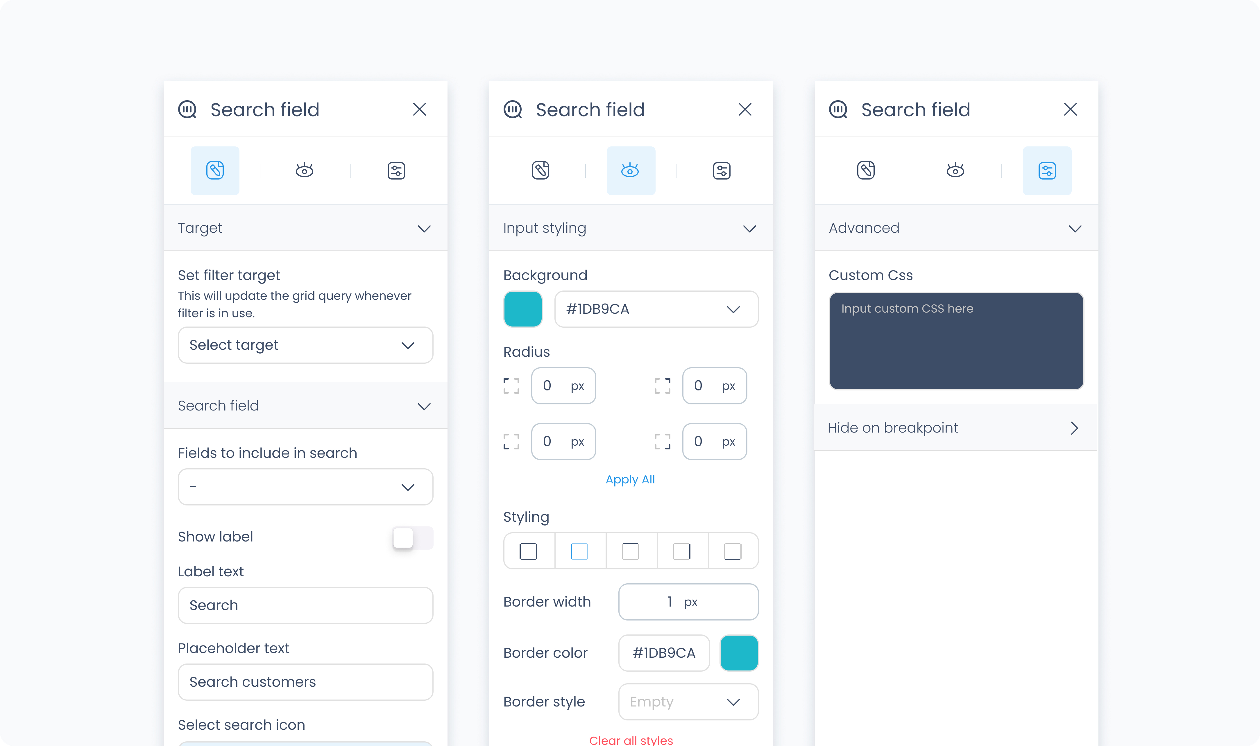
Set filter target – Defines which element will respond to the search input (e.g., Order List #1).
Fields to include in search – Select which fields should be searched (e.g., Customer Phone, Product Name). You can select one or more fields depending on your target.
Show label – Toggles a label above the search input.
Label – Defines the label text (e.g., “Search”).
Input placeholder – Sets the placeholder text inside the input field (e.g., “Search by order #”).
Set active – Displays the search box in its "active" visual state inside the Builder. This is for preview only and does not affect live behavior.
Select icon – Choose a visual icon to display inside the input field (commonly a magnifying glass).
Select icon – Defines which icon clears the input. This typically appears as an “X” or backspace symbol.
The Styler tab controls how the Searchbox looks and behaves in your layout. You can style the input field, label, icons, and container.
At the top of the Styler tab, you can switch between different interaction states to style how the Searchbox looks in each context:
Default – The normal appearance when the Searchbox is idle and unfocused.
Hover – Applies when a pointer is moved over the Searchbox.
Focus – Applies when the Searchbox is selected (e.g., tapped or clicked) and ready to receive input. This state often highlights the field to signal it’s active.
Active – A short-lived state that appears during direct interaction, such as while typing or clicking. It’s typically used for press feedback or subtle animations.
Disabled – Applies when the Searchbox is inactive or unavailable to users.
Each state supports its own styling.
Controls how the search input itself looks.
Color – Sets the text color.
Alignment – Aligns input text (left, center, right, justify).
Font size – Adjusts the size of the input text.
Text font – Selects the font family (e.g., Poppins).
Font weight – Sets the thickness of the font (e.g., 300, 500).
Gap – Adds space between elements inside the input container.
Controls alignment within the component:
Content direction – Horizontal (→) or vertical (↓) layout
Align / Vertical align – Positions content within the container
Gap – Adds spacing between inner elements
Background color – Sets a solid fill behind the input field. Supports static, global, or dynamic colors.
Height – Set to Fill or Custom. If Custom, specify a pixel value (e.g., 64 px).
Width – Set to Fill or Custom. If Custom, specify a pixel value (e.g., 64 px).
Controls space inside and around the component.
Padding – Adds space between the input and the edge of the container.
Margin – Adds space outside the component, between it and surrounding elements.
Use Apply all to assign the same value to all sides.
Radius – Rounds the corners of the component. Set each corner independently or use Apply all.
Styling – Choose which sides have borders (all, none, top only, etc.).
Border width – Sets thickness in pixels.
Border color – Use a static, global, or dynamic value.
Border style – Choose from solid or dashed.
Shadows – Adds visual depth using drop shadows.
If you’ve enabled the label above the input field, you can customize it here:
Color – Sets label text color.
Alignment – Left, center, right, or justified.
Font size – Controls label size.
Text font – Choose a font family.
Font weight – Adjust thickness of the text.
Size – Set in pixels.
Rotate – Rotate the icon by degrees.
Color – Choose a static, global, or dynamic color.
Size – Set the size of the icon in pixels.
Rotate – Rotates the icon visually.
Color – Use a static, global, or dynamic color.
The Advanced Settings tab provides tools for more complex use cases such as fine-tuned styling.
You can define custom CSS rules to override or extend the elements styling.
