The Custom Sale element allows users to enter a custom product value at checkout, ideal for situations where a specific item doesn’t exist in the product catalog. It includes a numeric keypad, quantity adjusters, and an optional tax toggle.
This element is most often used in retail flows that need flexibility for one-off transactions, donations, or miscellaneous items. Once a price is entered, users can tap “Add to Cart” to include the amount in the sale.
Content direction: Choose horizontal or vertical layout for the keypad and value section.
Align / Vertical Align: Control horizontal and vertical alignment of content within the element.
Gap: Adjust spacing between the two primary sections of the component.
Background color: Apply a solid fill to the entire Custom Sale component.
Image upload: Set a background image using file upload or image library.
Image layout: Choose between cover and contain modes for how the image fills the component.
Height / Width: Define the size behavior (Fit, Fill, or Custom) and set pixel values if applicable.
Padding / Margin: Set spacing around and inside the element.
Radius: Add corner rounding to the element.
Styling: Set border width, color, and style.
Shadows: Optionally add shadow for visual depth.
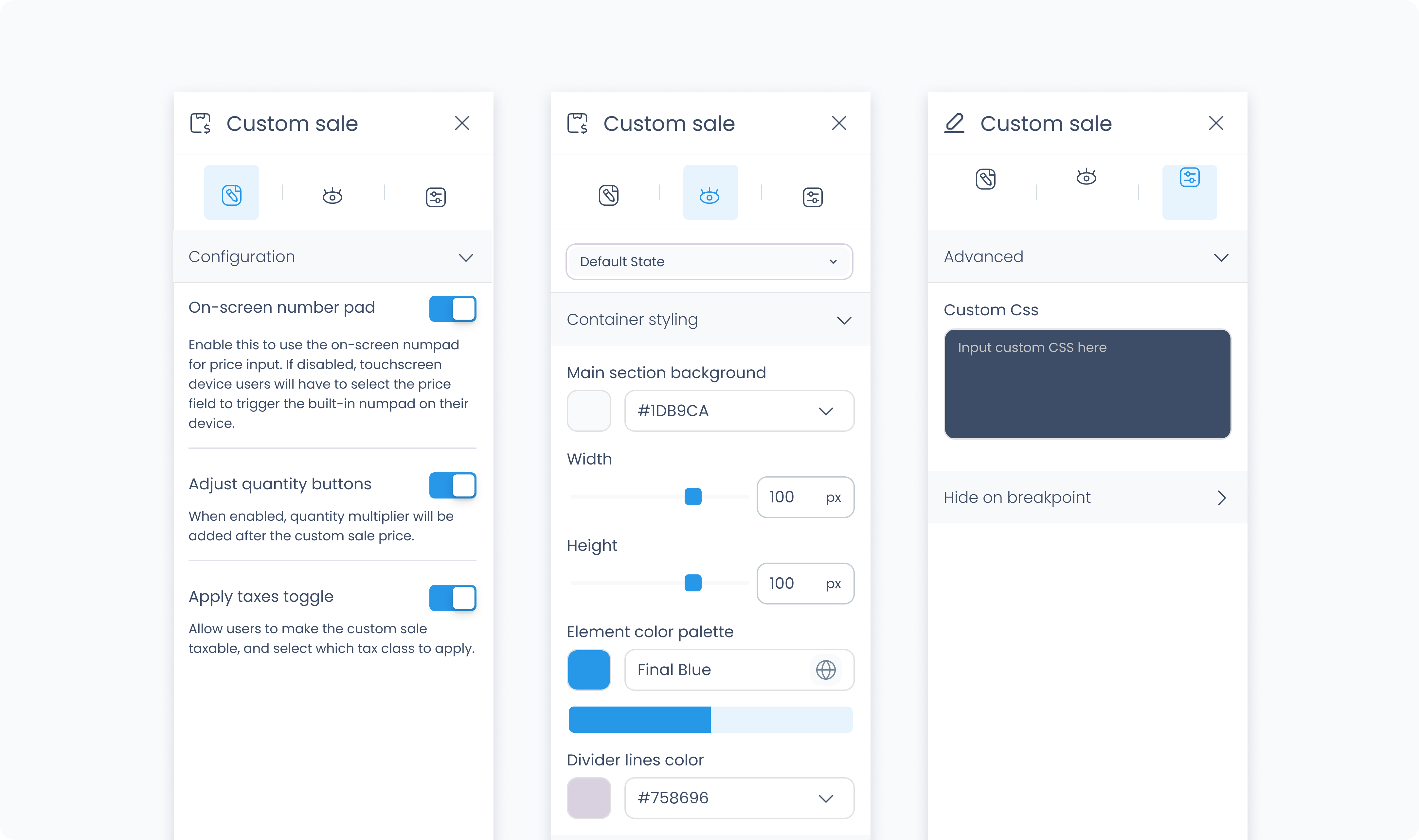
The Advanced Settings tab provides tools for more complex use cases such as fine-tuned styling.
You can define custom CSS rules to override or extend the elements styling.
