The Order Data element displays all products from a selected order, including their names, quantities, prices, and totals. It automatically reflects the currently selected order from the Store Data tab.
This element must be placed inside an Order Section, where other dynamic order details, like order number, status, or customer, are also displayed. Together, they provide a complete snapshot of the selected order.
The Styler tab controls how the Order Data block looks and behaves in your layout. You can adjust dimensions, background color, and spacing to ensure it fits seamlessly with other elements in your view.
Height & Width – Controls the container's dimensions:
Scroll – Allows vertical scrolling if the content exceeds the container height.
Fill – Expands to fill the parent container.
Custom – Set specific pixel or percentage values.
Background Color – Sets a solid background for the entire Order Data container. You can use static, global, or dynamic colors.
Padding – Adds inner spacing between the container’s edges and the Order Data content.
Margin – Adds outer spacing between this element and other elements in the layout.
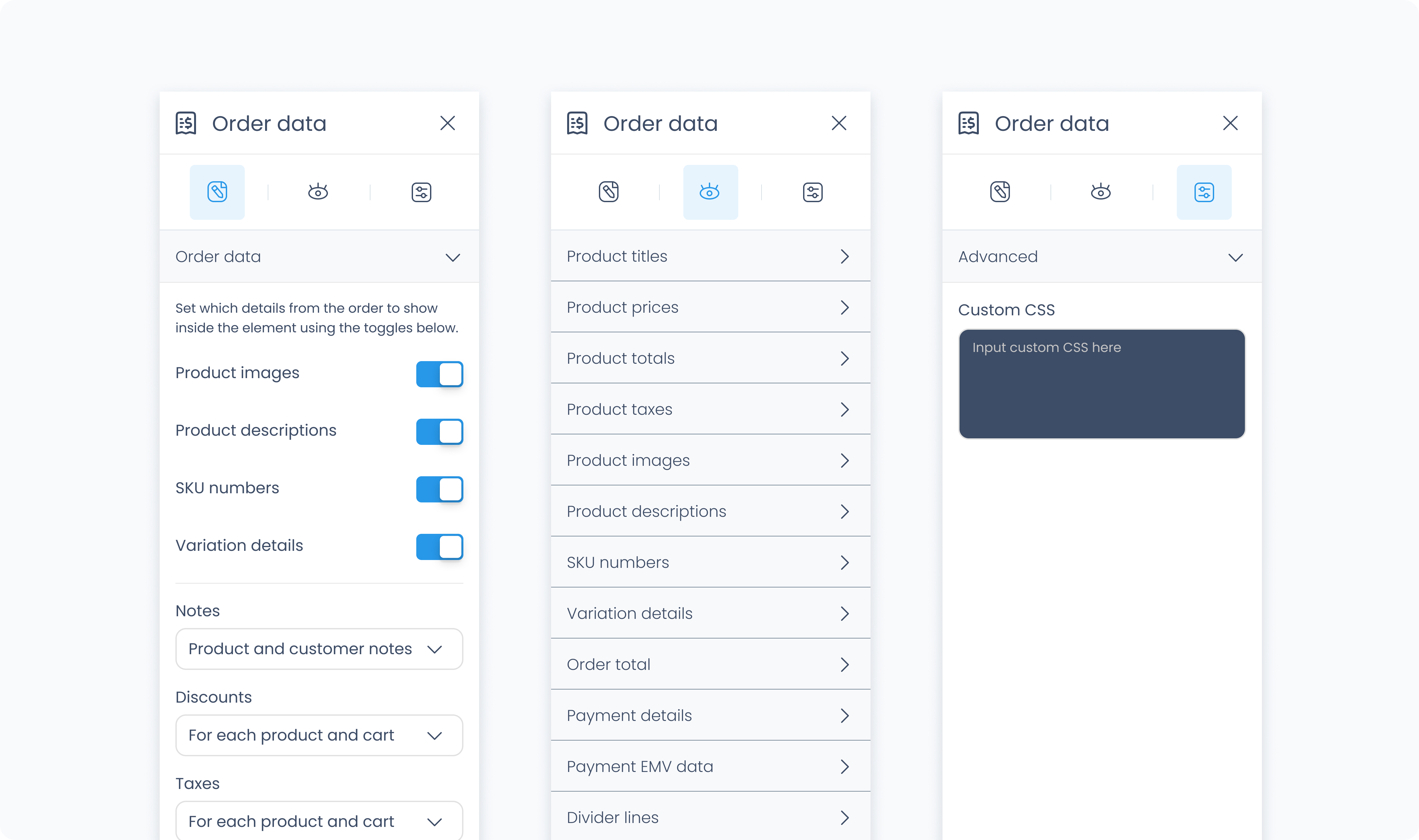
The Advanced Settings tab provides tools for more complex use cases such as developer-level styling.
You can define custom CSS rules to override or extend the element’s styling. This is useful when you need fine control beyond what the Styler panel offers.
Conditional visibility lets you control when the element appears or disappears based on logic (e.g., only show if the role is admin).
To use:
Toggle Turn on conditions, then define your rule and set what happens (e.g., show, hide, or disable)
