The Product Quantity element is used to increase or decrease the quantity of the currently selected product. This control does not add the product to the cart, it only adjusts the active product’s quantity. To complete the flow, pair it with a separate button that triggers the Add Product to Cart action.
This tab allows you to customize the icons used to increase or decrease quantity.
Select the icon that will reduce the product quantity.
Select the icon that will increase the product quantity.
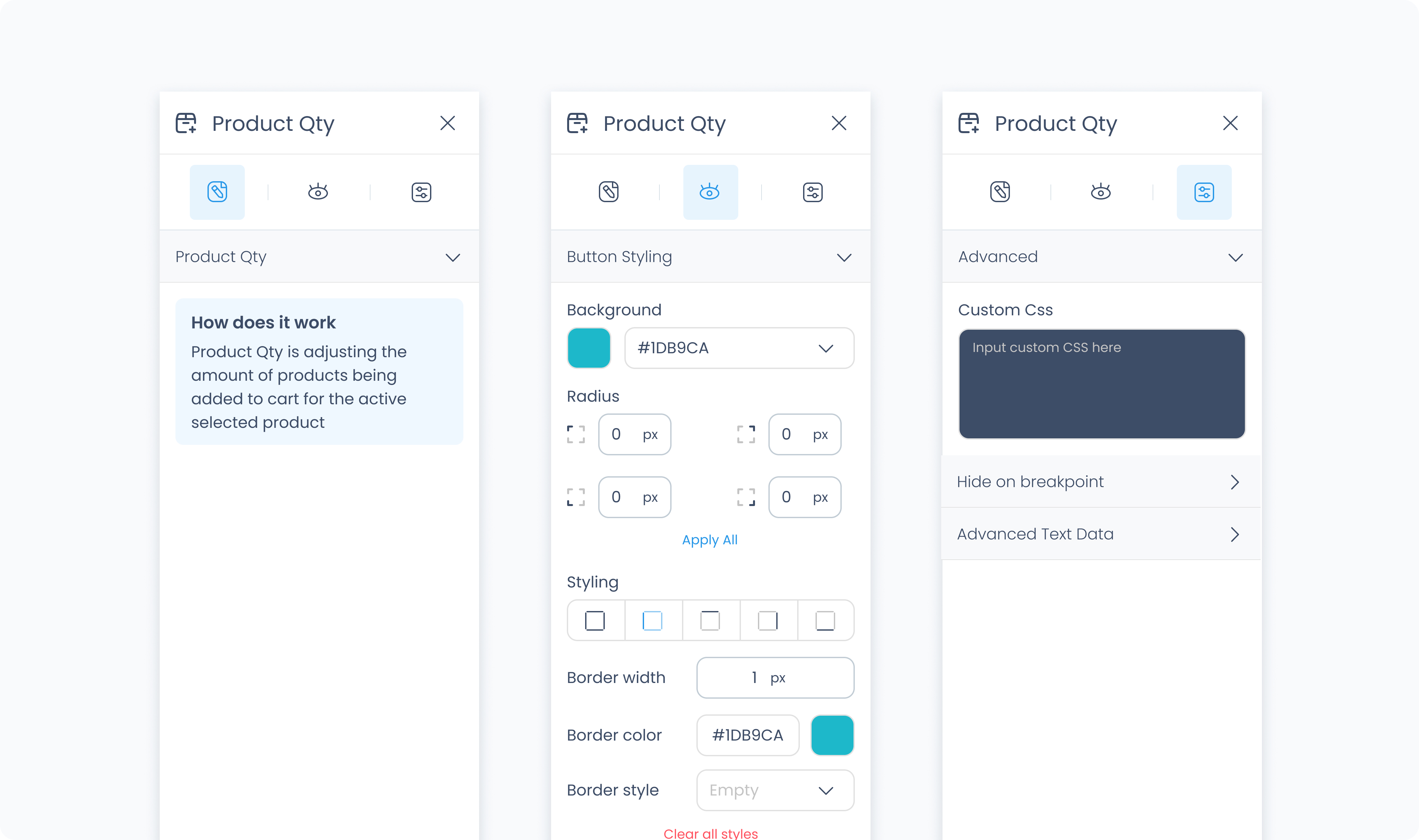
The Styler tab controls the appearance and layout of the quantity selector. You can adjust spacing, borders, typography, and more. This element includes separate style controls for its increment and decrement buttons, along with general styling options.
At the top of the Styler tab, choose a state to apply styles to:
Default – Regular appearance
Hover – When the component is hovered over
Active – When tapped or clicked
Disabled – When the component is inactive
Each state has its own styling options.
Background color – Sets the background of the entire quantity selector. Supports static, global, and dynamic values.
Radius – Rounds the corners of the grid. Set each corner or use Apply all for uniform rounding.
Styling – Choose which borders to show (all, none, specific sides).
Border width – Set thickness in pixels.
Border color – Supports static, global, or dynamic values.
Border style – Select from solid, dashed, or dotted borders.
Shadows – Adds depth to the grid using drop shadows. You can:
Adjust X and Y offset
Set blur and spread
Choose a shadow color
Use Clear all shadows to remove them
Padding – Controls inner space between the element edge and its content. Configure sides individually or use Apply All.
Margin – Adds space outside the component to separate it from other elements.
Color – Sets the color of the quantity number.
Alignment – Aligns the number text left, center, or right.
Font size – Sets the size of the displayed quantity.
Text font – Selects the typeface used for the quantity.
Font weight – Controls how bold the quantity number appears.
Width – Sets the width of the number display. Use a custom pixel value or leave it dynamic.
Background color – Sets the background color for both increment and decrement buttons.
Radius – Rounds the corners of the buttons. Can be customized per corner or with Apply All.
Styling – Choose which sides have visible borders.
Border width – Set the thickness in pixels.
Border color – Choose a static, global, or dynamic color.
Border style – Select from solid, dashed, or dotted borders.
Shadows – Adds depth to the grid using drop shadows. You can:
Adjust X and Y offset
Set blur and spread
Choose a shadow color
Use Clear all shadows to remove them
Padding – Adds inner spacing inside each button. Use per-side controls or Apply All.
Size – Adjust the icon size in pixels.
Color – Set a static, global, or dynamic icon color.
The Advanced tab provides options for adding custom styles to the product quantity.
Use this field to apply custom CSS rules to the entire element. These styles override any settings configured in the Styler tab.
