The Navigation Menu element displays a list of tappable links that guide users through the flow. It’s commonly used for sidebars or section headers.
The Editor tab lets you configure the list of navigational links shown in the menu.
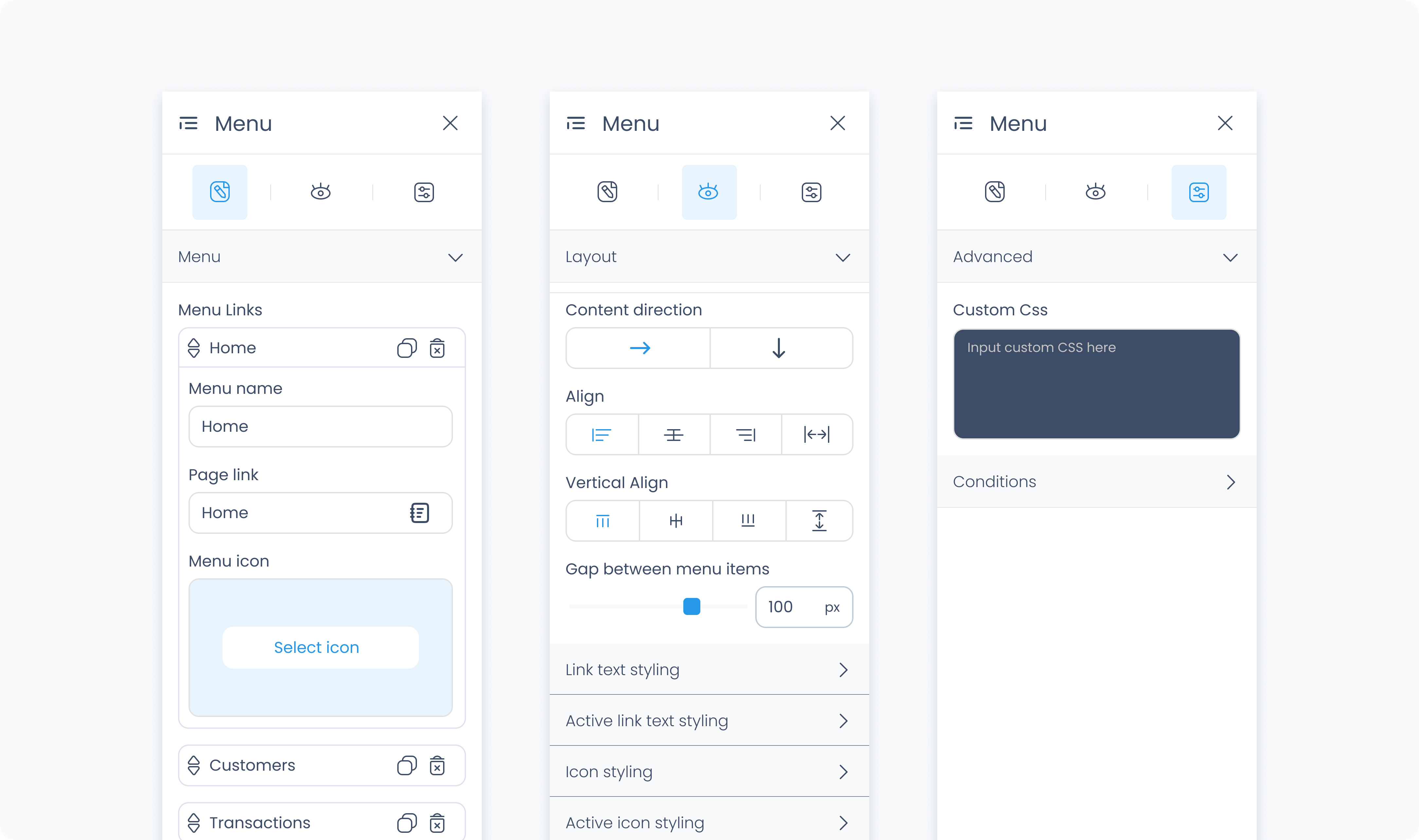
Menu links – Each menu item includes the following fields:
Menu item name – The label that appears in the navigation list.
Page link – Select a destination from the pages available in your flow, the Station Home, or the previous page.
Select icon – Optionally choose an icon to display alongside the label.
You can reorder items using the drag handles on the left.
Use the duplicate and delete buttons to manage individual links.
Add link – Adds a new menu item to the list.
The Styler tab controls the appearance and layout of the menu and its links. You can style both the container and individual menu items.
At the top of the Styler tab, you can define how the element appears in different states:
Default – Normal appearance
Hover – When hovered over
Active – When tapped or clicked
Disabled – When the element is inactive
Each state can have its own set of styles.
Controls how the overall menu container behaves within its parent.
Content direction – Sets the layout of the full menu to horizontal or vertical.
Align / Vertical align – Controls how the menu aligns within its container.
Gap – Controls the space between items. You can define the value in pixels or percentages.
Background color – Sets a background color for the entire menu container.
Height and Width – Controls how the menu fills space in its parent:
Fill – Expands to fill the parent container.
Fit – Shrinks to match the content’s dimensions.
Scroll – Adds scrollbars when content overflows.
Custom – Set specific pixel or percentage values.
Padding – Adds space inside the container’s outer edge.
Margin – Adds space outside the menu, separating it from other elements.
Controls the layout and spacing of the individual menu links.
Content direction – Sets the direction of content within each link.
Gap – Controls the spacing between text and icons in each menu item.
Controls how the text appears for each link.
Color – Sets the text color. You can use a static color or bind it to a global or dynamic value.
Alignment – Adjusts horizontal alignment of text within each link.
Font size / font / font weight – Fully customizable. You can set styles for:
Each link individually
All links at once using Apply to all menu links
Controls the appearance of icons within each menu item.
Size – Sets the icon size in pixels.
Rotate – Rotates the icon by a specific number of degrees.
Color – Set individually or globally. Use Apply to all menu icons to update the entire list at once.
The Advanced Settings tab allows for additional customization.
You can define custom CSS rules to override or extend the styling of the entire navigation menu. This applies across the overall container.
