The Divider Line element adds a visual separator to your layout. It can be used to break up content or add decorative accents. You can customize its style, direction, spacing, and color to match the flow’s design.
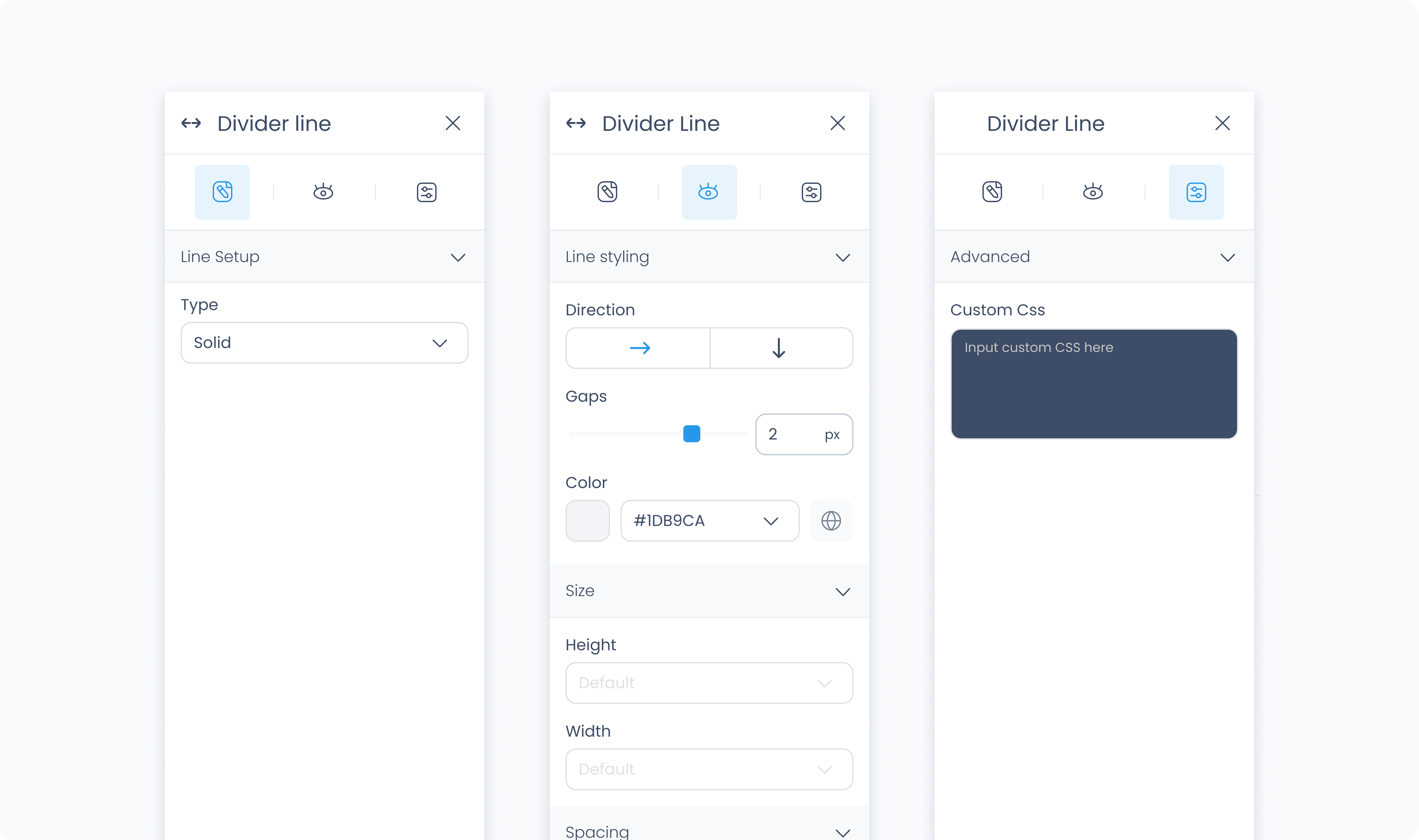
The Editor tab lets you choose the divider’s type.
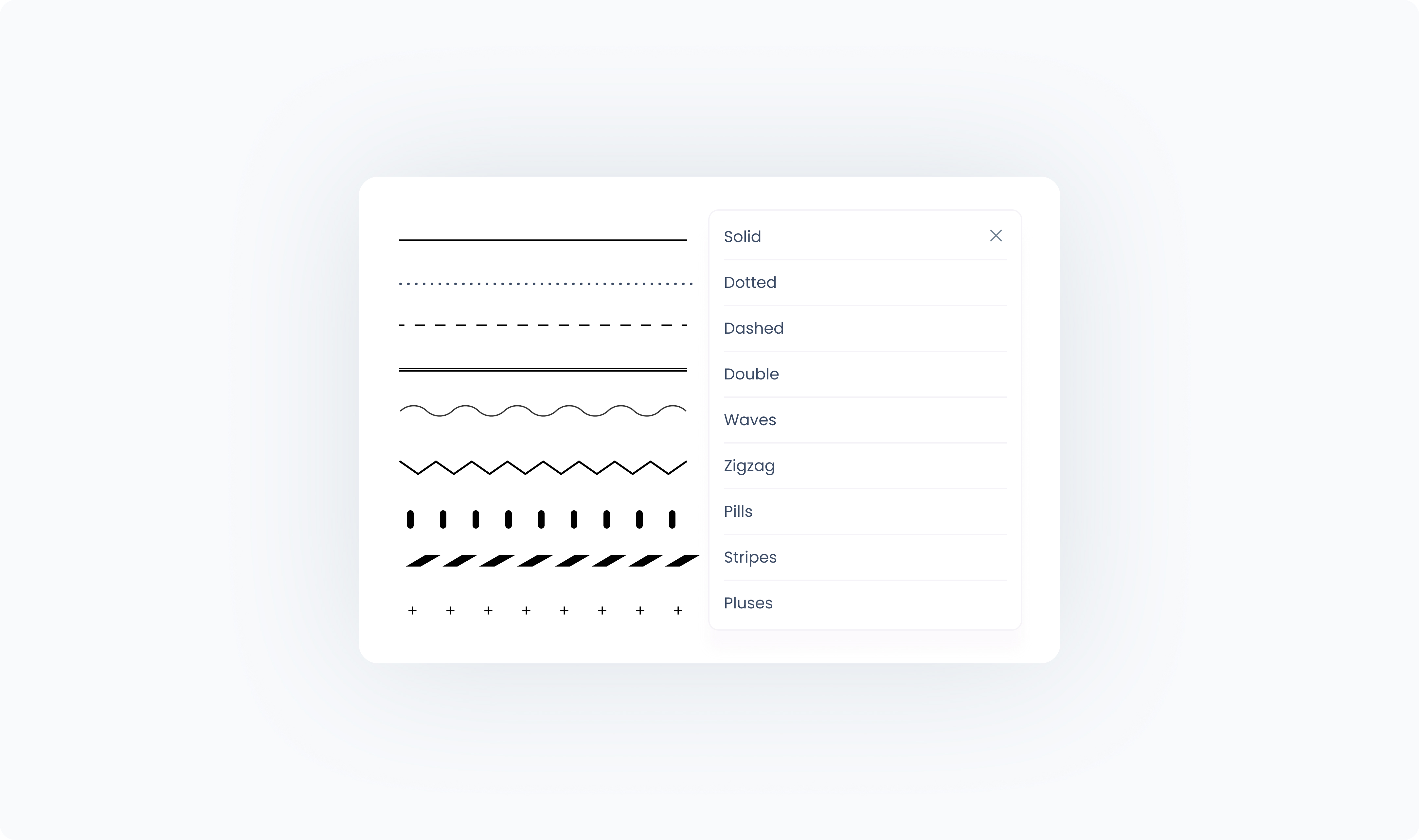
Type – Choose the visual style of the divider from a variety of options:
Solid – A single, straight line
Dashed – A broken line with evenly spaced dashes
Dotted – A sequence of small circular dots
Double – Two parallel lines
Waves, Zigzag, Pills, Stripes, Pluses – Decorative variations that can add personality or visual rhythm to the flow
The Styler tab controls the appearance, layout behavior, and spacing of the divider.
At the top of the Styler tab, you can define how the element appears in different states:
Default – Normal appearance
Hover – When hovered over
Active – When tapped or clicked
Disabled – When the element is inactive
Each state can have its own set of styles.
Direction – Choose whether the line is drawn horizontally (→) or vertically (↓).
Color – Sets the color of the divider line. You can use a static color or bind it to a global or dynamic value.
Width – Sets the width of the divider. Accepts pixel or percentage values.
Height – Sets the height of the divider. Accepts pixel or percentage values.
Padding – Adds space inside the divider’s outer edge. Padding can be applied individually or using Apply all.
Margin – Adds space outside the divider, separating it from surrounding elements.
The Advanced Settings tab allows for additional customization.
You can define custom CSS rules to override or extend the divider’s appearance.
