The Image element displays a static or dynamic image in your flow. You can use it to showcase products, add logos or branding, illustrate promotions, etc. Images can be uploaded directly or pulled from your data source, and support full styling, positioning, and action linking.
The Editor tab lets you choose the image source and optionally assign an action.
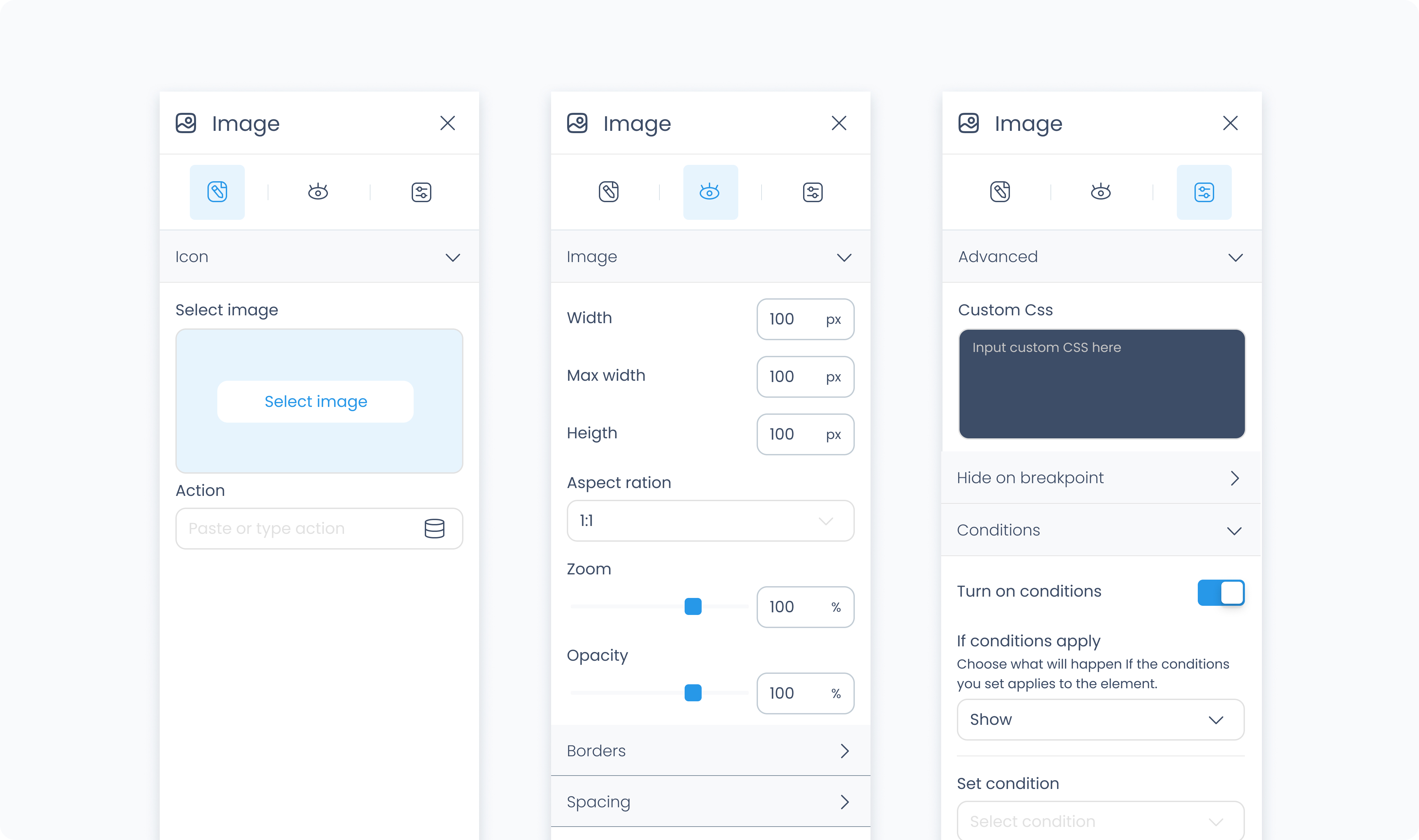
Use the Image section to upload a static image or bind it to a dynamic value from your data source.
Use the Action section (lightning icon) to link an existing action or create a new one. This allows the image to trigger behaviors like navigating to another page, opening a pop-up, or triggering a dialog box when tapped or clicked.
The Styler tab controls the appearance of the image. You can adjust its layout behavior, size, position, spacing, background, and borders.
At the top of the Styler tab, you can define how the element appears in different states:
Default – Normal appearance
Hover – When hovered over
Active – When tapped or clicked
Disabled – When the element is inactive
Each state can have its own set of styles.
Image fit – Determines how the image scales to fit its container:
Contain – Scales the image to fit entirely within the container while maintaining its aspect ratio.
Cover – Scales the image to completely fill the container while preserving its aspect ratio. Portions of the image may be cropped.
Zoom – Available when using Contain. Lets you scale the image within the container for a closer or tighter appearance.
Image position – Available when using Contain. Lets you adjust where the image sits within the container using alignment controls or numeric positioning.
Width / Max width / Height – You can set the image dimensions using pixels or percentages. Leaving these fields blank allows the image to fill the available space in its parent container.
Opacity – Controls the image’s transparency. Use this to fade the image or soften its visual prominence.
Background color – Adds a solid fill behind the image. This becomes visible when the image has transparency applied (i.e., when opacity is less than 100%), or when it has padding.
Padding – Adds space inside the image’s outer edge. This can be applied individually or using Apply all.
Margin – Adds space outside the image, separating it from surrounding elements.
Radius – Rounds the corners of the image. Set each corner individually or use Apply all for uniform rounding.
Styling – Choose which sides have visible borders.
Border width – Sets the thickness of the border in pixels.
Border color – Pick a static color, or use a global or dynamic value.
Border style – Choose from solid, dashed, or dotted borders.
Shadows – Adds visual depth behind the image. Use the shadow controls to:
Set X and Y offset values to move the shadow horizontally or vertically
Adjust Blur to soften or sharpen the shadow edges
Set Spread to control how far the shadow extends outward
Change the shadow color
Use Clear all shadows to remove them
The Advanced Settings tab provides tools for conditional visibility, dynamic formatting, and custom styling.
You can define custom CSS rules to override or extend the image’s appearance. Custom CSS takes precedence over styles set in the Styler tab.
Conditional visibility lets you control when the image appears, disappears, or becomes disabled based on logic.
To use:
Turn on conditions
Define your rule and choose what should happen when the condition is met
