The Text element is used to display static or dynamic written content in your flow. It can be placed inside tiles within lists, grids, and other layout structures to show contextual information. It can also be used in standalone sections to add instructions, headings, descriptive text, etc.
The Editor tab lets you define the text content and assign an action to the element.
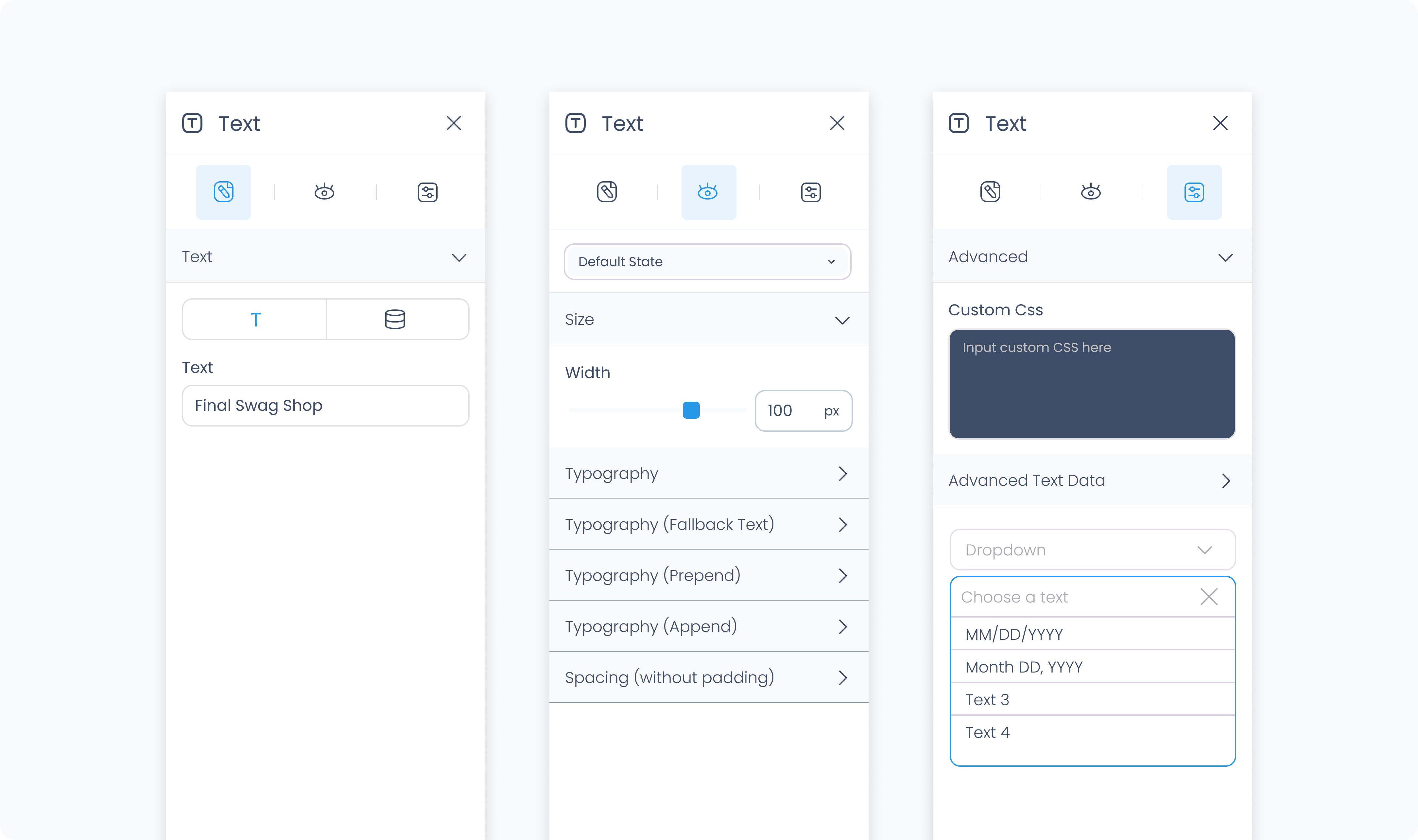
Use the Text section to enter static text or connect it to a dynamic value. You can bind it to product names, customer emails, order totals, or any other field available in your data source.
Use the Action section (lightning icon) to link an existing action or create a new one. This allows the text element to trigger behaviors like navigating to another page, opening a pop-up, or triggering a dialog box when tapped or clicked.
The Styler tab controls how the element looks and behaves in your layout. You can adjust alignment, font, size, spacing, and more.
At the top of the Styler tab, you can define how the element appears in different states:
Default – Normal appearance
Hover – When hovered over
Active – When tapped or clicked
Disabled – When the element is inactive
Each state can have its own set of styles.
Width – Controls how the element fills space in its parent container. The Text element only supports width, not height.
Fill – Expands to fill the available space
Fit – Shrinks to match the size of the text
Scroll – Enables horizontal scrolling if the text overflows
Custom – Set a specific width using pixels or percentages
Controls the appearance of the text itself.
Color – Sets the text color. You can use a static value, a global color, or a dynamic value.
Alignment – Align the text to the left, center, right, or justify across the container.
Font size – Use the slider or enter a value in pixels to control the size of the text.
Text font – Select a specific font family, or leave it as “inherit” to use the global font.
Font weight – Set the thickness of the font (e.g., 300 for light, 500 for medium, 700 for bold)
Margin – Adds external spacing between the text element and surrounding content. You can apply margin individually for each side, or use Apply all to affect all sides at once.
Note: The Text element does not support internal padding, since it does not contain child elements.
The Advanced Settings tab provides tools for more complex use cases, such as dynamic behavior or developer-level styling.
You can define custom CSS rules to override or extend the element’s styling. This is useful when you need fine control beyond what the Styler panel offers.
Conditional visibility lets you control when the text element appears or disappears based on logic (e.g., only show if the role is admin).
To use:
Toggle Turn on conditions
Define your rule and set what happens (e.g., show, hide, or disable)
These settings are available when the text is connected to a dynamic value.
Prepend – Adds static text before the dynamic value (e.g., “In stock:”)
Append – Adds static text after the dynamic value (e.g., “units available”)
These controls help you format dynamic text inline without needing multiple elements.
