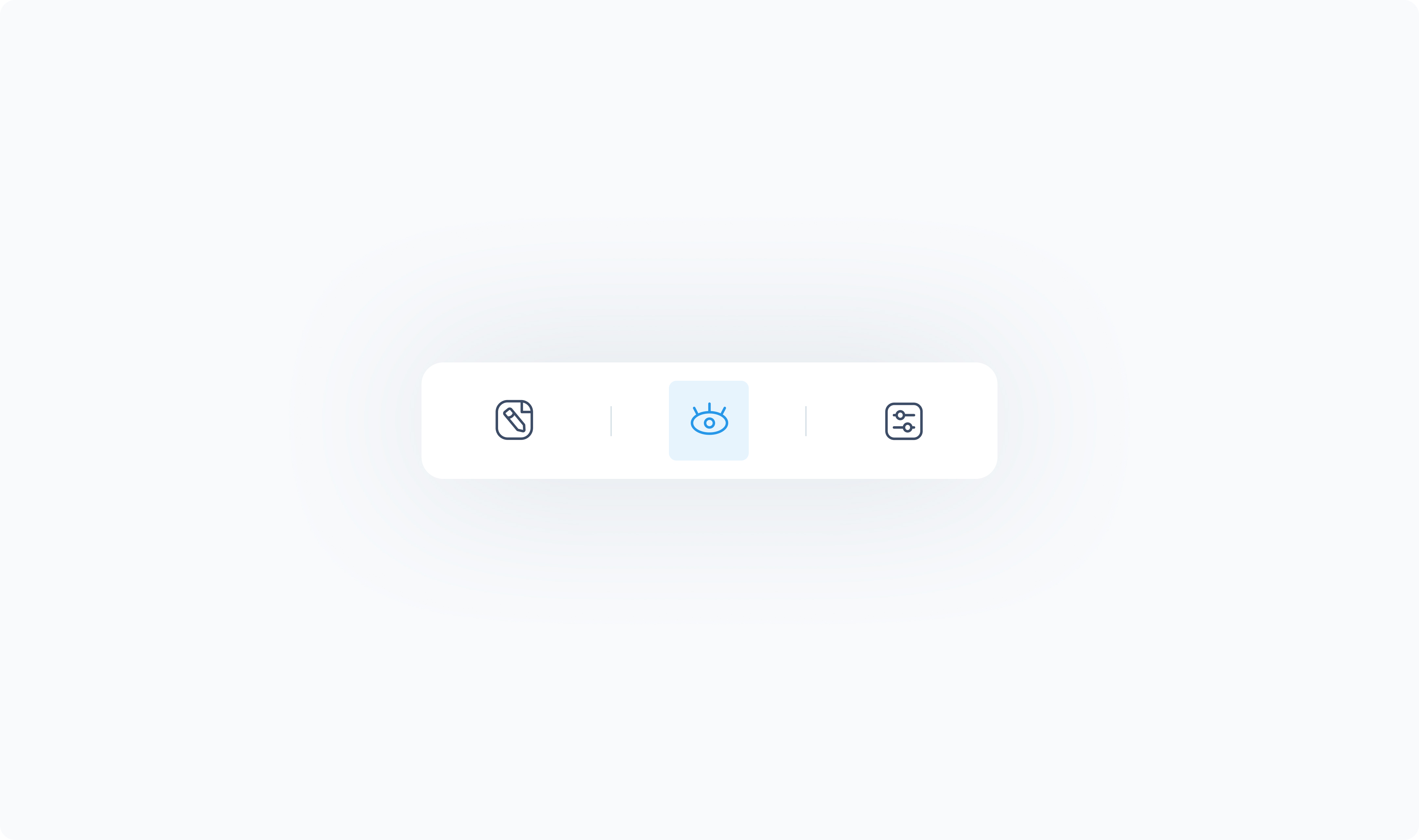
Location: Center of the element panel (eye icon)
The Styler tab controls the visual appearance and layout of the element. It lets you define how the element looks in different states (e.g., default, hover, active, disabled, etc.).
The options available in this tab may vary depending on the element you’re styling.
Common styling options include:
Layout – Direction, alignment, and spacing between children
Size – Height and width settings (Fit, Fill, Custom, Scroll)
Spacing – Padding (inside) and margin (outside)
Borders – Corner radius, stroke width, color, and style
Shadows – Optional drop shadow settings
Typography – Font, size, weight, alignment, and color
Background – Solid fill or dynamic color options
Icons – Size, color, and rotation (if supported)
Some elements also include special styling sections for things like headers, tabs, or buttons within the component.